4 Data Visualizations That Crop, Zoom and Frame Our World
“Every data set that the city [NYC] releases tells a story. This blog is all about telling those stories, one data set at a time.” - I Quant NY
Some data visualizations tell you stories while others let you be a data detective and narrate your own.
Moritz Stefaner, creator of the data visualization SelfieCity, presents data visualizations as a “macroscope” that let you study the infinitely complex. Letting us look at society and reality, but cropped, zoomed and framed.
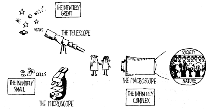 Illustration of a Macroscope from The Macroscope a New Scientific System by Joël de Rosnay. (1979)
We’ve picked some of our favorite data visualizations and look at why they work and what makes us love them.
Some Data Visualizations Tell You a Story…
200 Countries, 200 years in 4 minutes
Hans Rosling is well known in the data visualization world. His spitfire personality helps narrate his visualizations on world health.
The visualization, performed live, compiles over 120,000 numbers telling us the journey of our converging world from poor and sick to healthy and wealthy.
This data visualization shows the general trends over time as advancements in technology and medicine made life expectancies and incomes to rise. It also shows adverse effects on health and income, for example, World War I and the HIV epidemic in South Africa.
Why it works:
- It’s easy to understand. Although 120,000 data points went into creating this data visualization the bubble chart is easy to comprehend. As you progress through the 200 years you follow the story.
- It’s attractive. The bullet-like speed and general design of the visualization draw you in.
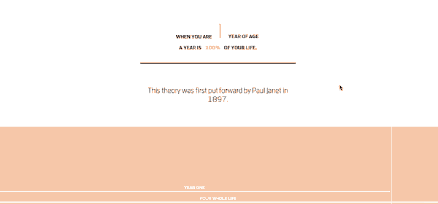
Why Time Flies
Have you ever thought back to summer when you were 10 years old. It seemed to last forever. You had so much time to swim, go hiking and even attend a summer camp or two.
Now, time moves fast. Months fly past you in a whirlwind.
An Austrian designer Maximilian Kiener created an interactive visualization that tells the story of how we perceive a year based off of Paul Janet’s 1897 theory on why time seems to move faster.
“It’s because we perceive time relative to the ‘absolute’ time we can compare it to”
At 10 years old one year is 10% of your life, at 30 one year of your life is 3.33% and at 90 one year is only 1.11% of your life.
Simply put, the longer you live the shorter each year feels.
Why it works:
- This visualization only moves as you move. You keep scrolling, and you just don’t stop.
- It’s simple. The statistics behind the data visualization aren’t complex. You take one year and divide it by the total. 30 years old. 1/30 = 3.33% of your life. There isn’t a lot of color, you just stay inside the data and watch it unfold.
Others let you explore
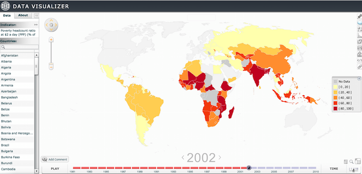
Data.WorldBank Poverty
The World Bank is the largest provider of development data in the world.
They have tons of great visualizations that you can find at data.worldbank.org but we picked the poverty data visualizer to show how the World Bank let’s you explore. (We even built a project for the World Bank on bringing data to the sub-national level)
This visualization provides you with six levels of poverty indicators from 1981 to 2010 globally.
This data shows you the changes that have occurred over two decades. It tells a story of hope for development but also shows what areas are still battling poverty.
Why it works:
- It’s customizable. You control the indicator, the date range, and the speed at which you progress through the data.
3200 Selfies in 5 cities
This data isn’t pretentious. It doesn’t tell you what to think and allows you to draw your own conclusions.
It lets you be a data detective.
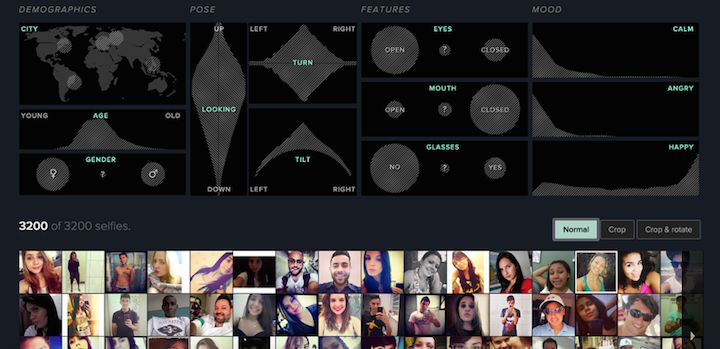
The data visualization presents 3200 selfies (yes… selfies) from 5 different cities around the world and breaks down the content: male/female, open/closed eyes, tilted left or right etc…
You can easily find a narrative within the selfies that you can share and explore with your friends.
Why it works:
- It is easy to tell your own story. What story do you want to tell? Men with glasses in Bangkok. Angry women in Moscow. People looking up with closed eyes. Filtering is all connected so by changing one reference point you can build your own story.
Whether you want to listen to a story or explore on your own, data visualizations are helping write the complex and inter-connected story of our world.
We are always looking for creative and unique visualizations. If you stumble across one or are working on one yourself tell us about it on Twitter.
Do you have data that you’d like to visualize on your own? The Knight Foundation and Wiredcraft partnered to create CSViz so you can tell a story of your own.
Stay tuned
Follow our newsletter or our WeChat account; every other week you'll receive news about what we're up to, our events and our insights on digital products, omnichannel, cross-border ecommerce or whatever the team fancies.
-
Add us on WeChat

-
Subscribe to our newsletter