Creating an interactive report with Google Data Studio
What is a reporting dashboard, and why do you need one? We’ll take you through the basics of Google Data Studio, a free data visualization tool that you can use to automate your reporting.
We recently held our first Data workshop here at the Wiredcraft office, focusing on the basics of Google Data Studio so that attendees could understand its uses, tools, and create their first reporting dashboard.
The class had limited spots so that we could give each attendee the guidance they needed to complete the 5 exercises we assigned them - in case you missed out, here’s a quick summary of the workshop, along with the slides and exercises so you can try it out for yourself.
What is Google Data Studio?
Data Studio is a free reporting and data visualization tool from Google. It works best with data from Google Analytics, but it can be connected up to any data source, including raw CSV or Google Sheets. There are also partner connectors that allow you to use data from sites such as Twitter, Facebook or HubSpot.
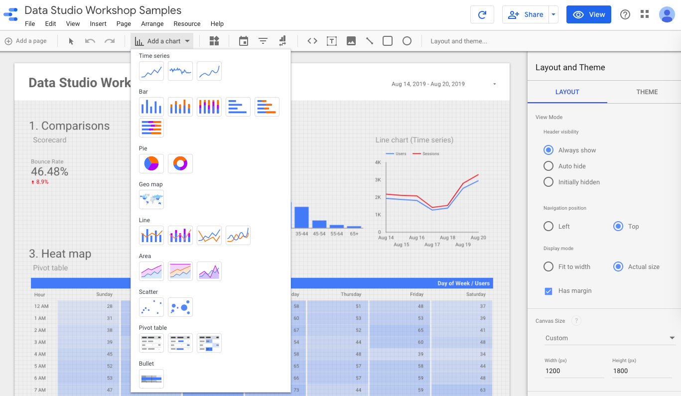
It allows you to create a reporting dashboard that pulls from your data source in real-time, and create tables and charts that best fit your needs.
Why should I use it?
The biggest reason is automation. There are often standard reports that are regularly requested by our clients that use the same metrics, but are just for a different time period or user segment. By creating a dashboard, clients can self-serve that data, so that they have easier and quicker access to what they need.
The second reason is visualization. Tables of data are fine for analysts who are looking for specific numbers, or are used to working with data in this way, but our brains are more suited to seeing patterns using charts instead. Using a dashboard can help to uncover seasonal or long-term insights that may have been missed.
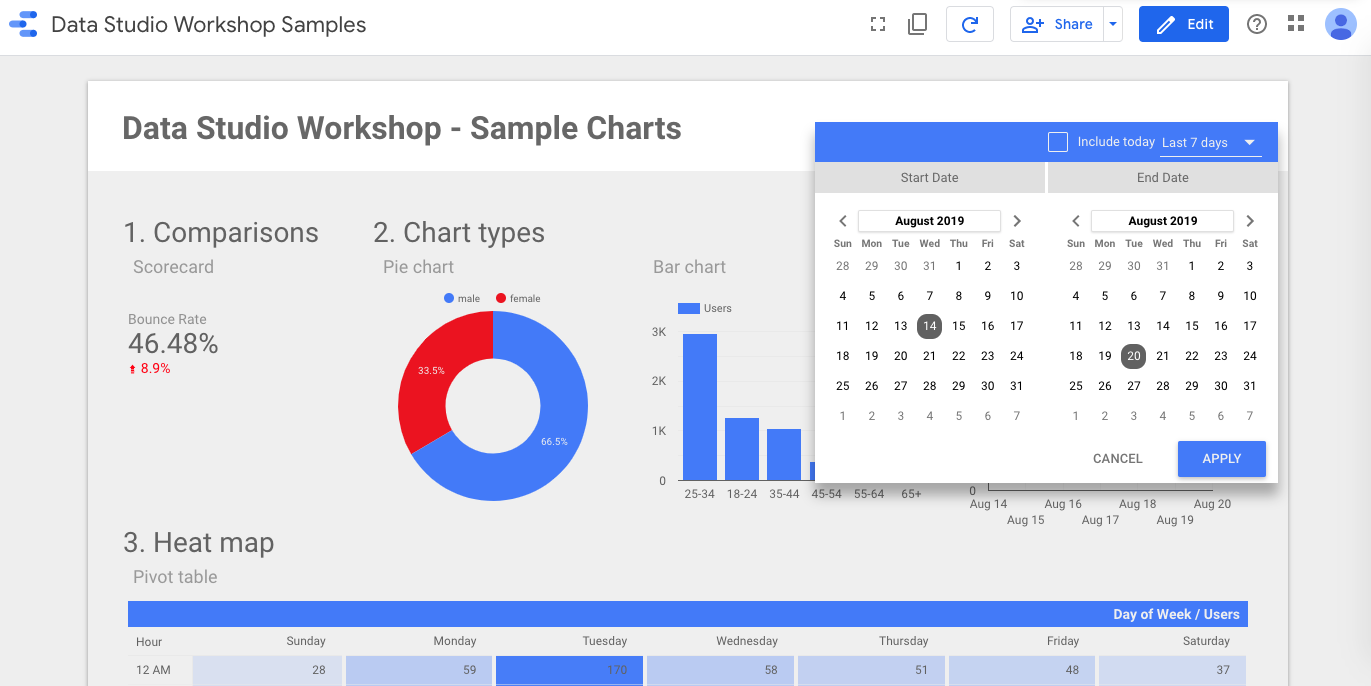
Data Studio offers a range of chart types to visualize your data:
- Table
- Scorecard
- Time Series
- Bar
- Pie
- Geo Map
- Line
- Area
- Scatter
- Pivot Table
- Bullet
- Treemap
The third reason is accessibility. Google Analytics, while easier to use than other similar platforms, still has a fairly steep learning curve in learning how data is recorded and where reports are kept. By creating a dashboard, clients do not need to learn how to use the GA admin, instead having all data they need in one single report.
So how do I get started creating my first dashboard?
Luckily, the slides from the workshop can be downloaded here. There are step by step instructions to help you get started:
- Getting access to the Google Demo account (in case you don’t have an existing data set)
- Creating a blank dashboard
- Connecting your data source
From there, we have 5 exercises, building up in difficulty:
- Creating a scorecard
- Adding various charts and understanding how metrics and dimensions interact
- Exploring data with a heat map to spot trends
- Understanding calculated fields to create your own metrics
- Custom conversion funnels to see how users drop off at each shopping stage
There are hints given for each exercise, but the last one in particular can be a little tricky! Let me know at [email protected] if you get stuck.
Stay tuned
Follow our newsletter or our WeChat account; every other week you'll receive news about what we're up to, our events and our insights on digital products, omnichannel, cross-border ecommerce or whatever the team fancies.
-
Add us on WeChat

-
Subscribe to our newsletter