Planning your digital strategy
A step by step guide to figuring out the scope and direction for your next digital product.
Most teams that approach us about a digital product or a digital strategy fall in one of these two categories:
- A problem but no clear plan: they understand the challenges they’re facing or what they’re trying to accomplish, but have no clear understanding of what’s in place, what’s possible and how they could or should execute.
- Lots of planning but no context: they have a long list of features or wireframes, but none of it is really explained or tied to either a business goal or a strategic challenge.
The first option is usually preferable, but in any case we have to walk these teams through a few steps that help us frame things and set a clear direction.
Since we don’t like repeating ourselves, we thought we’d share that process here and hopefully help others in the process.
What are we shooting for?
- Align the team; most teams we work with approach us thinking they’re 100% clear about what they’re trying to do. Invariably, the first meeting with us prove them wrong.
- Set the direction; once the team is aligned, you can hopefully set a direction for how you will solve the problem you’re trying to address.
- Articulate your vision; if you’ve set a clear direction and aligned your team, you should be able to articulate it in a way that is easy to communicate to others.
After that last point, you should have a document that helps you introduce your strategy and communicate it to other teams; technical or design partner, colleagues, management…
This process is a simpler, rougher version of the first step of our product design process (“Understand”).
Step 0 (optional): Stakeholders interviews
Before discussing things with the whole team, we like to send a questionnaire to each individual stakeholder with some of the following questions:
- Who are your users? Include any characteristics that we may need to take into account.
- What pain or problem is this product solving for these users?
- Why would they use this product over something else?
- What are the competitors for this product?
- Why would people choose this product over competitors?
- How do you define success? What tools/methods will we use to measure it?
- Is there something already in place; design, code, prototype..? If so, anything you’d like to keep or drop?
- From within your list of existing digital products, please list your top 3 design highlights.
- Within your industry, what other digital products do you like? Please explain why.
- What data do you currently have access to (e.g. analytics, user interviews, user feedback)?
- Where are your digital users coming from (e.g. online search, offline marketing, cross-promotion, etc.)?
- Do you have a style guide, brand guide, UI kit or design system?
- What are some concerns that you or your team may have about building this product?
- What are your team’s strengths and areas of improvement?
- Who is the key decision-maker when there is a disagreement between team members?
That should give you something to bite on for the next step…
Step 1: The product sheet
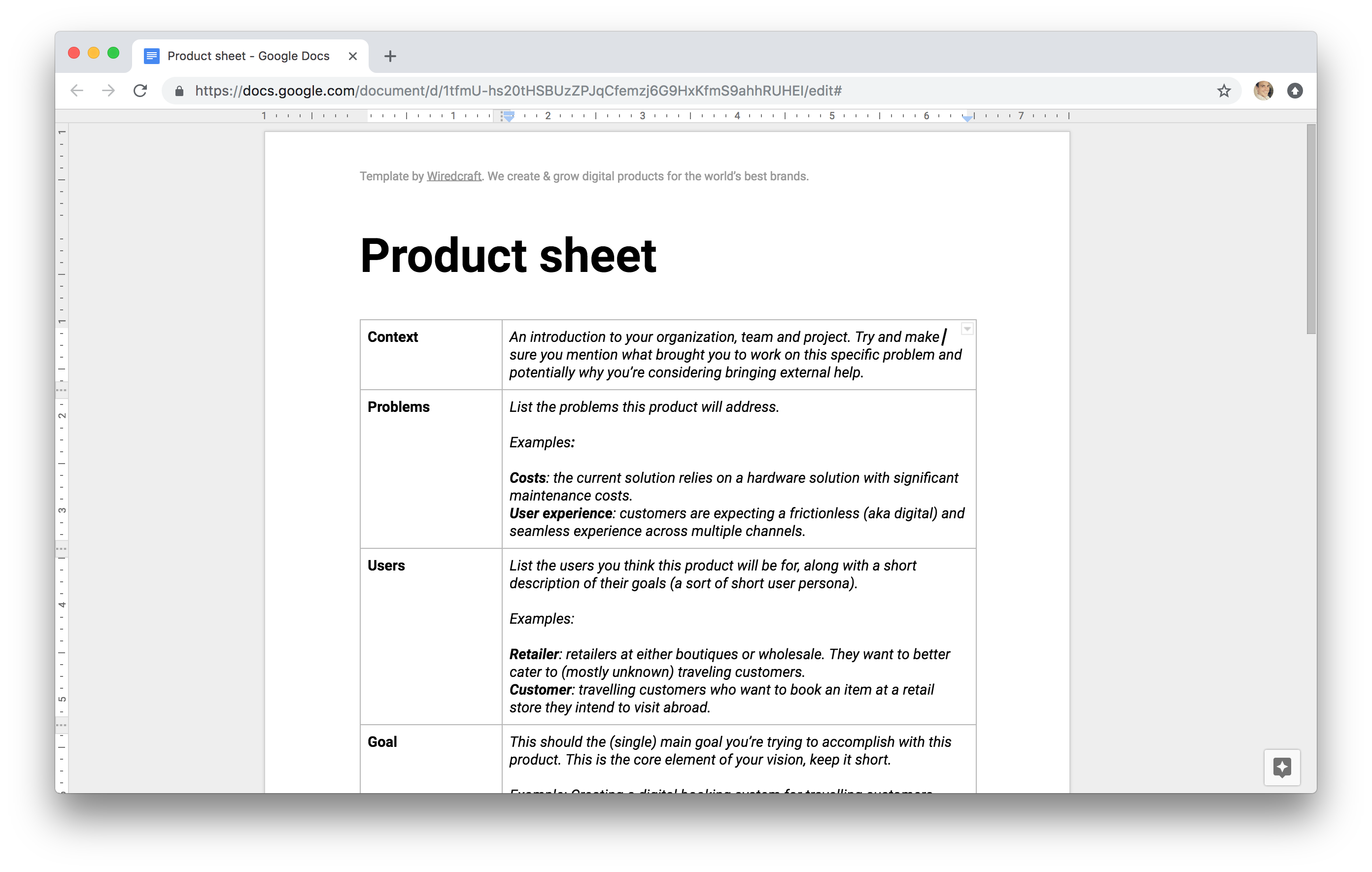
Each and every one of the digital products we work on comes with a document we call the “Product Sheet”. If done well, you should be able to use it to onboard a new team member or pitch your project to somebody else.
Here’s what it usually contains:
- Context; an introduction to your organization, team and project. Try and make sure you mention what brought you to work on this specific problem and potentially why you’re considering bringing external help.
- Problems: list the problems this product will address.
- Users: list the users you think this product will be for, along with a short description of their goals (a sort of short user persona).
- Goal: this should the (single) main goal you’re trying to accomplish with this product. This is the core element of your vision, keep it short.
- Opportunities: you may have secondary goals that you think you’ll be able to accomplish alongside your main goal. Again, keep it short.
- Demand: what evidence do you have that there is demand for this product? “My boss wants it” is not a valid answer.
- Success criteria: how would you evaluate if the product is a success or a failure once you’ve brought it to users? Don’t worry if your criteria isn’t perfect at this stage, what matters is to set the expectation that the team will use a measurable criteria to evaluate success (“Brand equity” isn’t an answer unless you propose a way to measure it).
- Inspiration: you should have looked at a fair amount of other solutions (competitors and else) that you can drive inspiration from. List them along with a short explanation of what could be learned from it.
- Resources: list any resource you have access to at this stage; analytics, user interviews, mockups, code, market research…
Download the Product Sheet Template
If you’ve asked questions to stakeholders (see previous step), you should be able to fill in a good deal of that document.
Then, we usually get in a room with the whole team and walk through the different topics and questions one by one, giving an opportunity to the whole team to discuss and align on each one of them.
You should be able to walk away from that first interaction with a filled up Product Sheet. This is a living document that should be continuously updated as you go through the next few steps.
If you’re curious as to what a Product Sheet looks like, just check out what we came up with when we were redesigning our website a few months ago.
Step 2: Storyboard
Before you get lost in the technical details (for example arguing over what the front page of your app should be), we strongly suggest you spend time storyboarding a full user journey, emphasizing the interactions outside of your product: how do you users come to it and what do they do after (as a consequence).
Keep app details to a minimum and try to illustrate the critical moments; how and why the user come to using your product and what key interaction will help him get out of it.
Here’s an example of a story board for a hotel booking website:
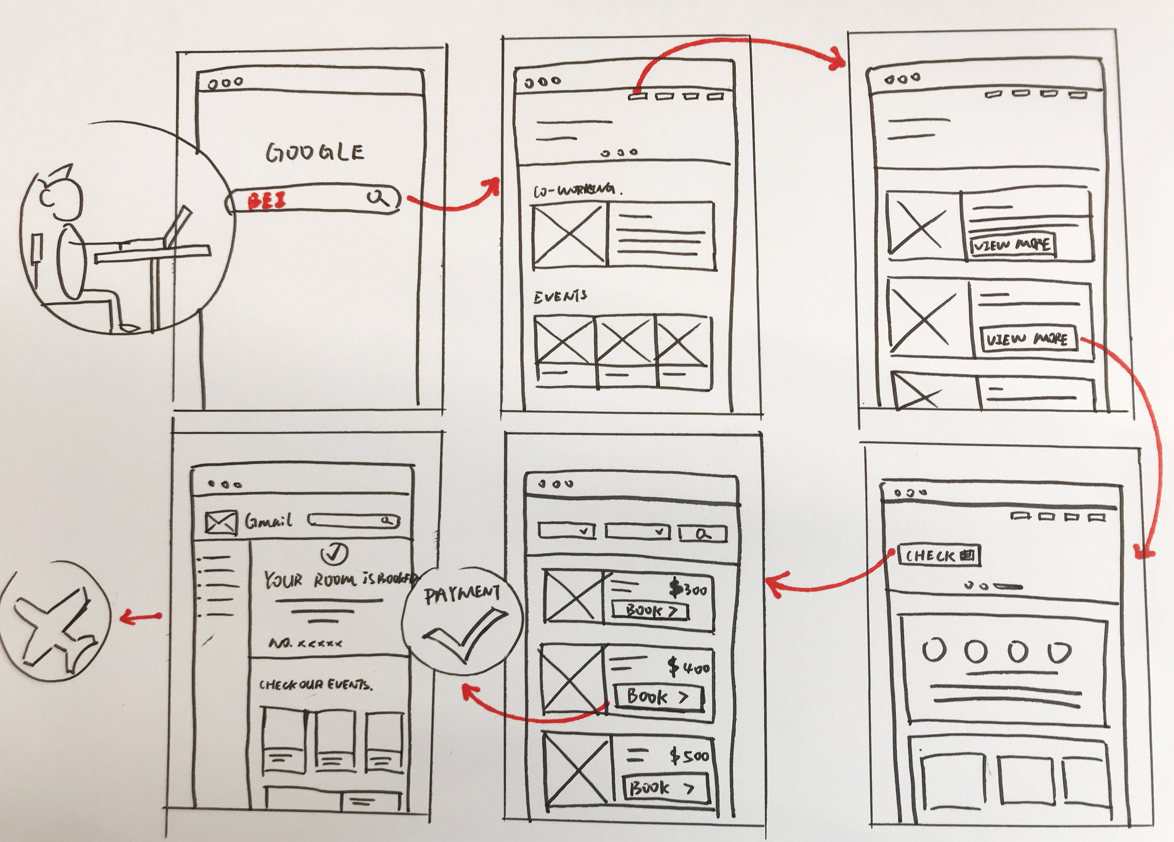
If the team is large enough, it can be useful to get two or more groups to come up with story boards on their own and the share it with everybody. This leads to interesting discussions on the part where people disagree.
Step 3: Userflow
The story board helps aligning the team on the real life context for the digital experience you’re designing. It also often helps surface gaps in you strategy: “How do users get to the app?”, “How do we know that the user paid his cart?”…
Once you have that, identify the segments of the story that your product handles and start working on userflows.
We usually encourage our team to use a template we have on figma as a starting point and try to stick to linear userflows with a single entry and a single exit, rather than trying to map the entire tree of possibility.
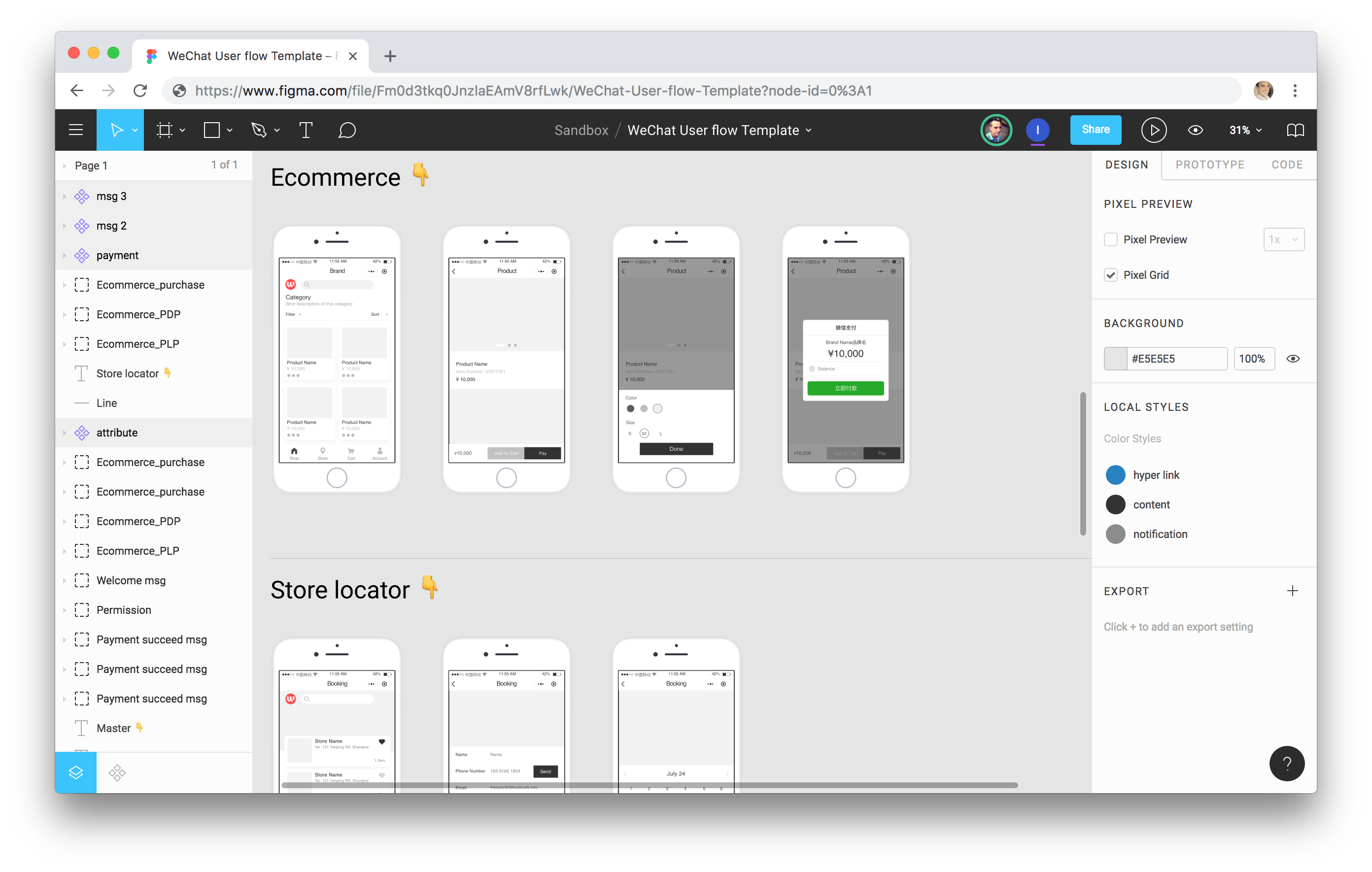
With that being said, simple hand drawn wireframes would do too.
Step 4 (optional): Features & Architecture
This is a tricky one.
We usually handle this part for our clients as it requires a knowledgeable person (developer, architect, strategist, product manager…) to look at what your team already has and figure out what needs to be built or plugged in.
The goal however is to create two things;
- A list of features. While we’ve focused so far on a user-centric representation of the digital experience, we need at this stage to list the features that will support the user stories we’ve identified. This may be a combination of screens (e.g. “Landing page”) and technical features (e.g. “Cart” or “Bookmarking”). Each feature usually comes with a short description.
- An overview of the technical architecture. It will help you identify what you can leverage in your existing architecture and which components need to be added. Below is a cleaner example of what it can look like, but a doodle would do.
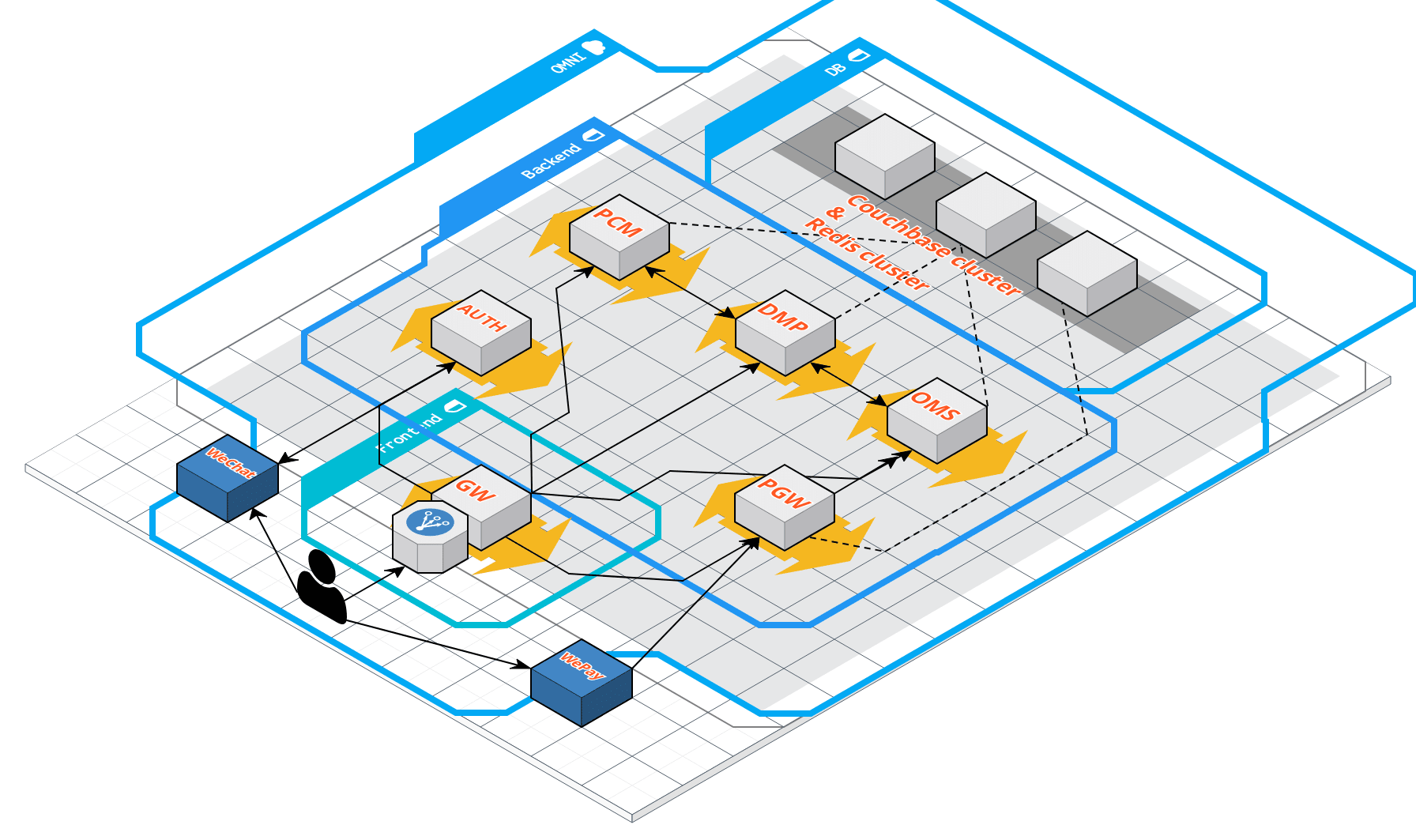
This is your blueprint for execution.
This is usually the starting point for our user stories, but at this stage you have enough to create a rough plan (budget & timeline).
Wrapping it up; Proposal & Budget
At this stage, the product sheet, story board and userflows should be enough for anybody who wants to understand what it is that you’re trying to do (and more importantly why).
This is enough for you to get proposals from your digital partners.
If you’ve been through the final step and have a list of features, creating a budget should be fairly straightforward:
- Evaluate the work load for the various technical features and components,
- Make sure you account for strategy and design (product design workshop, technical discovery, UI & UX…)
- Add the overhead: DevOps, project management, testing, launch, …
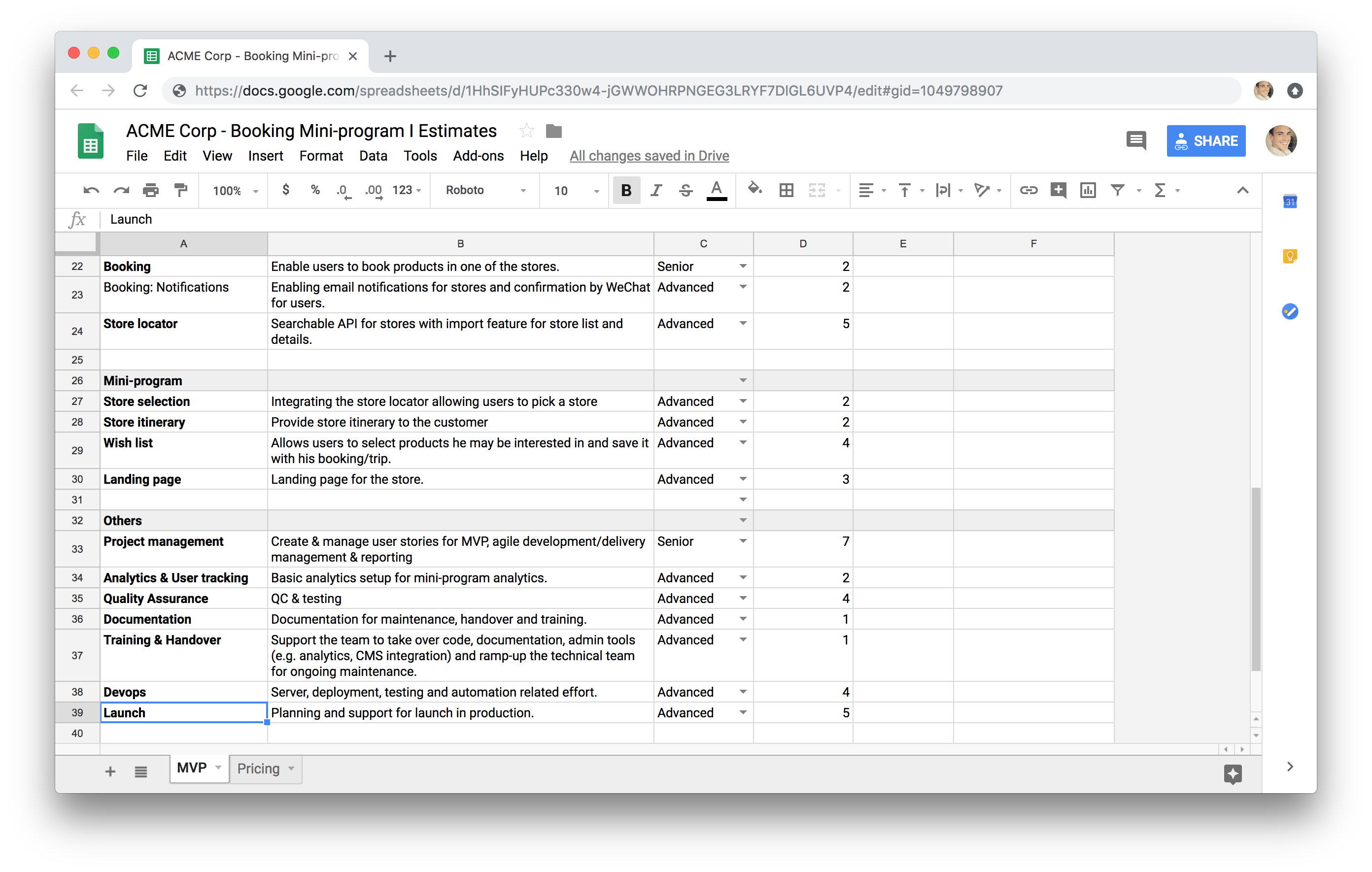
And voilà!
