Improving your SEO by analyzing reader experience
Improve your SEO by improving the reader's journey as a whole. A checklist for improving your blog experience.
If you type SEO into Google, you’ll get a lot of articles talking about Black Hat, White Hat and maybe even death to SEO. There are many camps on what’s the best way to get your content ranked. Personally, I belong to the camp that focuses on optimizing your content for the user over the machine.
I won’t get into too much detail on this methodology, as there are tons of great resources out there. For example Pricenomics Content Marketing Handbook, Amy Hoy at Unicronfree, and the multitude of articles on Hubspot, including this post on how to validate your topics.
Great content when you boil it down involves:
- Identifying your audience, and thinking about what problems they have
- Understanding the long tail queries your target audience is searching for
- Studying what content is at the top of the SERPs (Search Engine Result Page)
- Planning your content
- Writing and finishing it (often easier said then done)
- Publishing & promoting your content
Pause, while you craft the best piece of content you’ve ever written.
So, now you’ve followed all the fundamentals to providing great content.
You’re feeling like Hemingway. You just wordsmithed the shit out of that piece.
But…. half of enjoying reading something online is the experience of the page as a whole, not just the content. And as marketers we don’t always think about how SEO can be affected by what’s going outside the actual text on the page.
What do the search engines and algorithms like?
Google is invested in providing great service; there are a ton of search engines out there. When you think about it, why do you choose to use one search engine over another? Likely the answer is because their results answer your query (or data privacy, but that’s another issue)
- Interaction: Indicators like bounce rates and page depth let the search engines know that the content on that site is engaging and that it’s relevant to your query. Providing good content and user experience keep Google from being like, “Hey, your page is shit. Banished to page 7.”
- The long click: If you stay on a page for a long time, Google takes that as a sign of a good website i.e. it contained the correct information for your query
In summary, just a click is not a vote anymore. You need more than clicks alone to find yourself on those page one sweet spots.
So how do you get these golden tickets for your blog piece?
Here’s the checklist for improving your blog experience:
Clear messages

Babbel’s blog has a clear initial and secondary CTA: Reply to the post, and engage on social media.
There should be no confusion over what you want your user to do after they read the article. i.e. subscribe to your Newsletter, download a lead magnet, read a suggested article
- Keep it simple - ideally, you should only have one CTA on your page. The hard limit is two.
- What are your CTAs telling your reader? Is the micro copy clear? Run A/B testing to see which copy gets more engagement.
Navigating your content

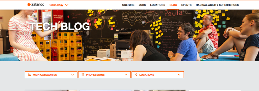
Zalando Tech provides categories to cater to their readers interest.
Do your readers know what to do after they finish reading your articles? Is there a clear journey for readers to follow? Do you have a funnel? Use data analytics to find where your readers start and leave your site.
- Have categories so that your readers can differentiate content on your page and be decisive based on topics.
- Create a list of your most popular posts
- Recommend content based off of what your readers are engaging with
- Search bar to navigate content
Share buttons
- Make it easy for people to engage with your content by having prominent share buttons
- If you get steady shares, then include the number of shares. You can plan for a monkey see monkey do effect.
Make your blog have a heart

Medium is a great source of inspiration to draw from for micro interactions to improve reader experience.
Does your blog stand out against your competition? There are small steps you can take to make your blog stand out from the crowd. You can see in the gif above that medium is a great source of inspiration to draw from for micro interactions to improve reader experience.
- Add small things like read time, photo of author, author bio, the ability to filter by author/category, consistency in formatting, varied media (videos, photos, illustrations), emphasized quotations & important context.
- Faces make people feel comfortable and indicate trustworthiness. Use faces in your content when applicable.
Converting
Are you making it easy for your readers to stay up to date on your blog? How do you interact with your reader?
- Are you catching your readers’ attention as they arrive or leave your page with a pop-up? Most importantly does it make sense to have the pop-up on the page, or is it going to put off your reader?
- You can use automation with products like Intercom or Get Drip to start a conversation with your reader.
- Do you have exclusive content that your readers can subscribe to receive such as ebooks or special offers?
- Do you make them sign in to receive content i.e. gateway content? I highly recommend you read the user experience of sign-in forms from my colleague Jan before you invest in this strategy.
To implement these, you should have already established your marketing voice, goals and plan with your team i.e. are you hard sellers, or do you prefer a softer approach? You can implement the checklist keeping in mind how you want to communicate with your clients and/or customers, but the most important part of this equation isn’t you. It’s your user.
The Human Experience
Don’t forget the solid principles of SEO; a machine is still learning from the interactions and the information that we provide them. Our top tips are to avoid all kinds of duplicate content - search engines hate this; watch your priorities with H1/H2 and alt tag since search engines are still using this to better understand your content. After you’ve performed these fundamentals, also consider how your readers are interacting with your page and the human experience on your blog.
So now you’ve read this and you’re like, “Wow that was some good shit.” But, this blog doesn’t have any of these things? What’s the deal?
Well, myself and my marketing and design colleagues have spent hours scouring the interwebs for delicious blogs and other websites to draw on, for the best practices that blend marketing and user friendly experiences for our very own website redesign. Stay tuned by joining our newsletter for updates on the redesign and see if we pass muster on blog experience.
Let us know if there is a blog that inspires you by sending us a tweet.