I’m not collecting the right data: now what?
A guide to making your data analytics usable for reporting.
We’ve already talked about how we create actionable data analytics strategies, from objective alignment to process documentation, so that your product team can effectively embed it in their roadmap.
However, that alone doesn’t guarantee your success.
In real life, you’ll often deal with multiple data sources, most of which won’t be in a format remotely close to usable for your reporting needs.
Also, sh*t happens: you may simply be tracking things the wrong way and can’t change your data collection strategy before the next product release.
Here are a few things you can do to fix your data and get to a report you can actually share with your colleagues.
Our examples below are based on the Google suite (Google Analytics, Google Sheets, Google Data Studio), but the ideas behind them can be applied to other tools and platforms as well.
Re-grouping data in a meaningful way
If you have edit permissions on a Google Analytics view, channel grouping and content grouping comes in handy as a way to re-organize your data into meaningful groups.
But if you don’t, or you want to group on a dimension other than page/screen name/source, here’s what you can do: re-organize groups in the data visualization tool, with the help of calculated fields and CASE statements.
On Google Data Studio, you can create a calculated field like this:
CASE
  WHEN condition THEN result
  WHEN condition THEN result
  ...
  ELSE result
END
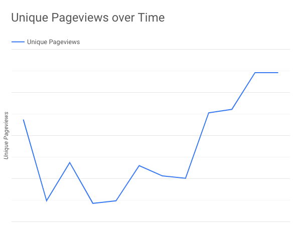
For example, if we look at the pageviews growth of our website, this is what we get:
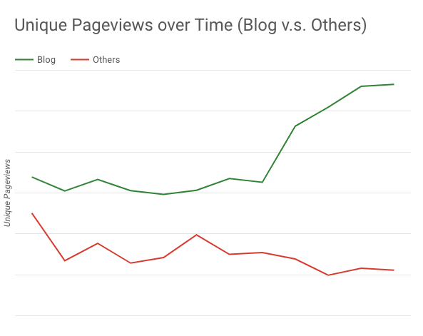
The problem is, we’d like to single out the growth of our blog. That’s where a CASE statement comes in handy:
CASE
  WHEN REGEXP_MATCH(Page, "^/blog.*") THEN "Blog"
  ELSE "Others"
END
Now we’re able to plot the blog and the rest of the site separately.
Complementing main data source with additional information
Sometimes the data you’ve collected doesn’t tell the whole story, so you have to pull in data from other sources and look at them together.
For online e-commerce tracking, this can be combining online and offline purchases from the same users.
I’m calling this horizontal data combining. If you imagine your separate data sets as two tables, this kind of data combining creates a new table that can have all columns from both original tables, making the new table horizontally longer. All it requires is (at least) one column as a shared key to match both tables.
This can be achieved using the built-in data blending feature from Google Data Studio, released back in July 2018. Simply connect to 2 different data sources, select at least one key dimension to join, and choose the rest of the dimensions and metrics you’d like to use in the blended source.
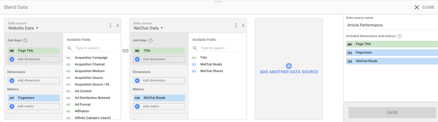
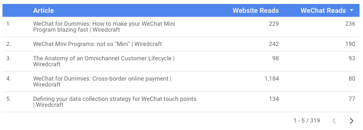
By blending the data, our team is able to see how our content performs across our own website and WeChat in one view.
Combining different data sources in the same format
As mentioned above, Google Data Studio lets you combine data horizontally easily. But vertically? Not that easy. If you’re lucky enough to have both properties are on a Google Analytics 360 account, you have access to roll-up reporting. But what about the rest of us?
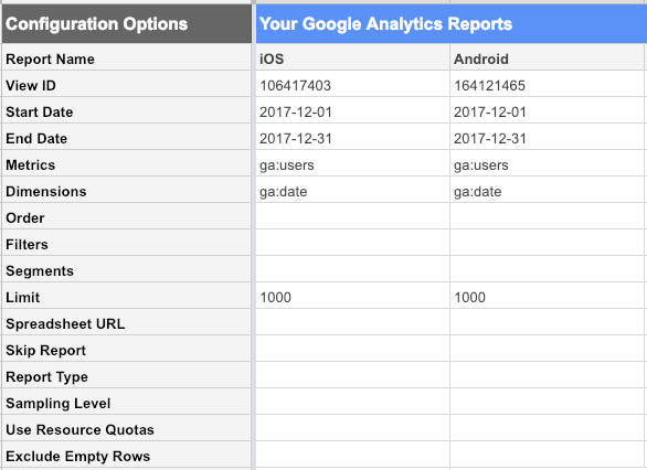
For example, if you’re tracking identical metrics for your iOS and Android apps to 2 different Google Analytics properties, aggregating the data will be your everyday pain.
For this kind of data combining, my go-to solutions are the Google Analytics spreadsheet add-on and Google Sheets.
The Google Analytics spreadsheet add-on acts as a tool to pull selected data from Google Analytics to Google Sheets. The add-on lets you fill in minimal information, then generates a new sheet with configurations of all your reports. From there you are able to customize the settings however you want.
To get the daily users for both our clients’ iOS and Android apps, we set the report configuration like this and hit “run reports”.
Daily users are pulled in, but into two different worksheets. Here’s where a QUERY function combines the data in one sheet.
QUERY({iOS Data Range;Android Data Range}, "select *", 1)
The final result is a single table with just two columns - date, and users. This creates a clean sheet for any data visualization tool to build charts and graphs from.
Stay tuned
Follow our newsletter or our WeChat account; every other week you'll receive news about what we're up to, our events and our insights on digital products, omnichannel, cross-border ecommerce or whatever the team fancies.
-
Add us on WeChat

-
Subscribe to our newsletter