How I Design Kickass Illustrations
Our designer Hazel shares her process for designing illustrations.
Beginning to design something new for a project is quite difficult because we don’t always fully understand the problem we’re going to solve. Drawing an illustration for a blog post or an email is as same as doing the design for a client project. I have to do research, set the goals, and then generate some ideas. After brainstorming, I pick the best idea and make it real.
We create a lot of original content for the Wiredcraft blog and newsletter, including illustrations and gifs. I’ve provided you a deeper look in the process I follow to create illustrations.
Understanding the Objective
Before I opened Sketch 3 and created something on the artboard, I searched for some keywords related to Thanksgiving on Pinterest and Google. There isn’t a Thanksgiving tradition in China, so I had to get some information to generate my ideas. I found a lot of visual elements on Pinterest, collected the ones I thought would be useful for creating the illustrations, and put them into my inspiration box. (You can create your own inspiration box as well!) I also learned all about Thanksgiving through searching on Google, so now I know Thanksgiving is a holiday filled with family, food, and warm feelings.
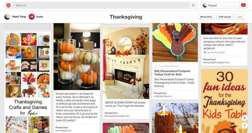
This is my inspiration box on Pinterest. I collected lots of things are useful to create my illustration.
Brainstorming
I collected lots of elements in my inspiration box, including a candle, pumpkin, turkey, pie, and variety of fruits.
In this stage, I sketched in my notebook as much as possible. I tried versions including the candle and pumpkin or something else, but in each iteration, I kept the turkey. The turkey is the most recognizable symbol connected to Thanksgiving, so I thought it needs emphasis on this illustration. The point is, pick the leading role and image you want to express in your work.
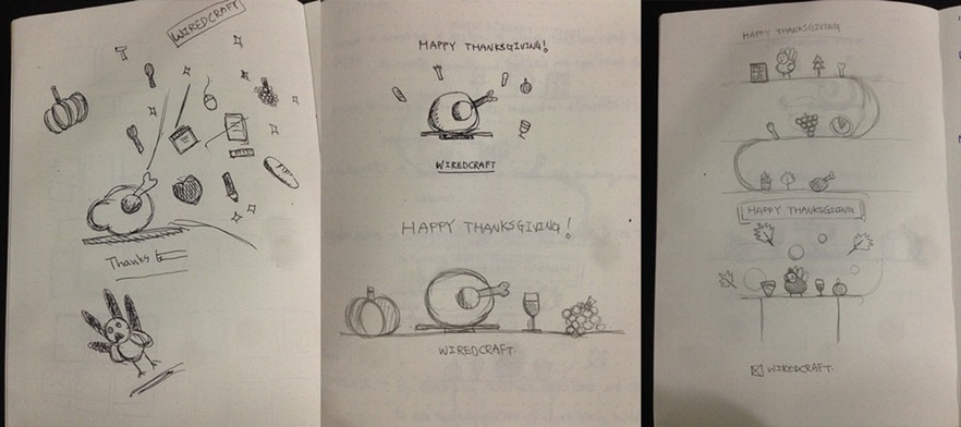
Coloring for Thanksgiving
I had 4 or 5 ideas that could become a real illustration. At this point, I not only had to set up colors aligned with warmth and happiness, but make sure the colors kept with visual hierarchy.
First, I selected orange (turkey and happiness), yellow (happiness) and pink (love), but the color palette looked a bit dark and these colors have a similar chroma.

Next, I adjusted the chroma and hue to make those color looks more balanced. However, none of the colors stood out in this set, so I had to pick one color and change the chroma and hue again to make it more obvious.

This is the final color palette I used to color the Thanksgiving illustration. Orange was much more standout than yellow or pink.

You must be curious about the progress I played with the colors. First, I gave the turkey orange and set the background as yellow with the similar chroma in Sketch. Obviously, it’s difficult to separate the turkey from the background. And the color of the turkey is a bit deep so that it didn’t look good. So, I changed the hue and chroma on the Fills section in Sketch to let the turkey be more balanced with the background.
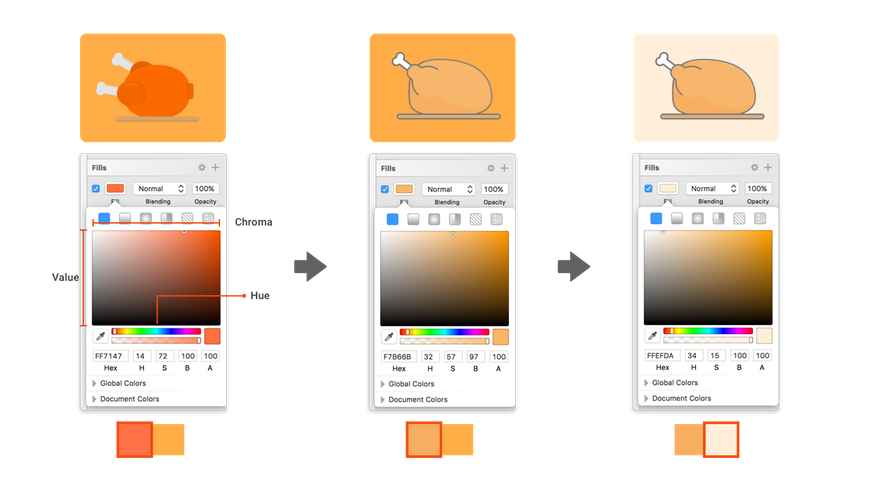
After that, although the turkey and the background were balanced, their hue were too similar. To let the turkey stand out from the background, I adjusted the background color and I tried to let the background be soft, so I reduced the chroma. Then, It looked much better than the original one.
Adding the Finishing Touches
In the final step, I thought I should really tell a warm story about Thanksgiving through my illustration. I put the colors and sketch together and focused on detailed design. I felt it had beautiful colors and good shapes, but it didn’t look warm enough and lacked some energy. I figured I’d have to find some elements in my inspiration box to decorate it.
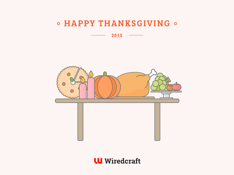
I added some icons related to Thanksgiving in the background to make it look more lively and I put a warm light behind the table. Finally, my work became the warm, happy illustration we needed for the campaign.

At Wiredcraft, we design our projects with this process: Understand, Brainstorm, Prototype, Validate. We apply the design process when doing illustrations for blog posts and newsletters as well. It helps us figure out what the point of the content is so we aren’t forced to make very abstract designs from zero. Also, it narrows our focus to what we want to articulate through our design. I think drawing a beautiful illustration is art, but drawing a beautiful and useful illustration is design - it solves real problems.