Engineering creativity
Why we think most creatives are bullshit and how our team engineers creativity.
Is ”creative” a bad word?. Creatives tend to only share their work once they consider it “done”. We obsess about the tip of the (creative) iceberg; the end result.
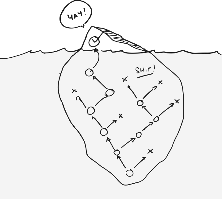
But by doing so, we hide the bulk of our work; all the failures, alternative ideas and dead-ends… And this is is where creativity actually happens. It is the meat of our craft.
This hurts us as a community on three levels;
- It slows our growth. Positive feedback may help us stay motivated, but we learn and grow from criticism and challenges, not coddling.
- It locks our learnings away. That bulk of the work that we’re not sharing; the failures, successes, dead-ends..? Others could learn from it.
- It hides the work and skews the perception others have of creative work. It makes people think less of our craft because they don’t see the committed, challenging process that it requires.
Ok, then what? This is why the Wiredcraft team applies an engineering process to our creative activities. We design much like we write software; collaboratively, in the open, with a clear process and clear goals.
A. Structure
Before we do any kind of work, our team agrees on how we do things in the first place. Most of it is captured in a wiki that collects methodologies, tools & concepts we can all get behind. We call it “The Playbook”.
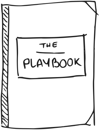 It’s actually public: playbook.wiredcraft.com and covers a lot more than just design. You’ll find sections about business, software development, our company…
Let’s look at 3 keys sections: Core design principles, Product design process & UI/UX design.
Core design principles
We are by no means assuming design can be reduced to a few tricks and guidelines, but the 4 principles below are key to our design approach:
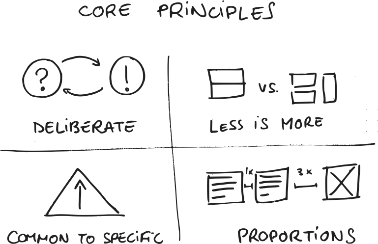
- Be deliberate. Meaning & function trump aesthetics, always. Design things for their use and intent, not because they look good or help balance your composition.
- Less is more. In the words of Antoine de Saint-Exupéry: “perfection is finally attained not when there is no longer anything to add, but when there is no longer anything to take away”. When challenged, you should be able to make up a rational case for anything that you’ve designed1.
- Design for the common, and build patterns. Don’t start designing things for special cases like landing pages. You want to focus first on the most commonly used features, and from there identify patterns that you can apply systematically to the rest of your design. Fight hard against any modification or addition to these patterns as you work your way up to more specific use cases (aka KISS).
- Focus on proportions, layout, colors & typography. Balance elements of your designs with the same proportions and avoid designing for pixel perfect situations (that’s a rare luxury with digital mediums). Obsess about finding (and stealing2) great colors and typography, they make the difference between good and great.
1: this doesn’t mean that you should justify everything and anything you do in advance, you have to get stuff done after all. But, when challenged about one of your choices, you need to be able to back it up.
2: there are many resources a couple of Google searches away: Adobe Color, Coolors, Font Pair, Google Web Fonts Typographic Project…
Product design
Our product design process helps us improve the odds of making something people want by focusing on the idea/validation feedback loop. We apply this process to most of what we do; it helps us design marketing experiments, write business proposals, shape our company strategy…
We took inspiration from Google Ventures’ Design Sprint, going iteratively through 5 steps:
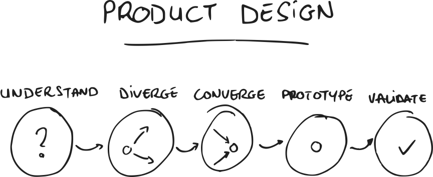
- Understand: establish the context and problem (e.g. “What data do we have?”, “What pain are we solving?”), list our assumptions and define how we intend to validate them.
- Diverge: generate multiple (potentially conflicting) solutions to solve the problem at hand.
- Converge: align the team around one approach (e.g. a single user flow/storyboard).
- Prototype: quickly build a prototype we can test.
- Validate: test the prototype, usually with actual users outside of our team, to learn what works and what doesn’t.
Each cycle helps us validate and invalidate our assumptions, and get us one step closer to understanding what works.
UI & UX design
When designing software, we refer to 2 main activities:
- User Experience (UX) is about how things work. It is usually associated with a collection of user-centric activities: user research, user flows, information architecture, wireframes… Its goal usually is about making things easy and intuitive for the end-user.
- User Interface (UI) is about how things look. It can overlap with some of the UX activities (e.g. wireframes), but is often more focused on wireframes, mockups, front-end code… The goal often is to define a consistent and pleasing visual “language” for users.
These activities usually run alongside through the whole project; UX and UI are rarely “done” (but so is software). They revolve around one of these tools/deliverables:
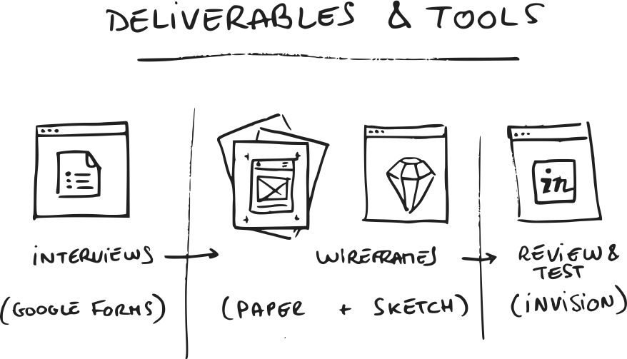
- User flow, Wireframes & Mockups; user flows and wireframes are probably the most ubiquitous tool for us. We almost exclusively design them with paper. We usually create mockups and final assets with Sketch and share them as interactive prototypes with InVision and/or Zeplin. We sometimes augment these tools with Adobe Illustrator, Adobe Premiere & Quartz Composer for specific needs (branding and video montage).
- User & Stakeholder Interviews; we run interviews with users and the project stakeholders to better understand the context of how the software is used, and its purpose. You can refer to the “Understand” phase of our product design process. User data: surveys, analytics, user testing…; these are usually used when the project has already been launched. Analytics tools (such as Google Analytics) are usually a must.
- User personas; user personas are a great way to improve the team’s understanding of the users they’re designing for, and help us empathize with them.
- A/B tests; we try and take as much of our design decisions with data. A/B tests are a great way to evaluate which of our variants (see “Diverging” in our product design process) performs better.
B. Context
Context helps us avoid starting our creative process with a blank canvas. In a vacuum and with no constraints, you can’t direct your creativity.
We do that by first framing the problem:
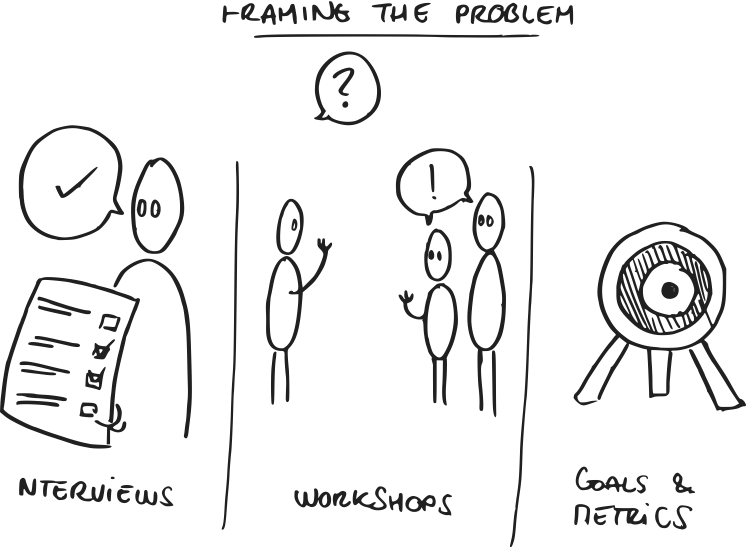
- We do user (and stakeholder) interviews.
- We run product design workshops with partners and users.
- We set clear goals and measure how well we do against them.
We steal shamelessly. We raid Dribbble and Google and figure out how others designed their solutions.
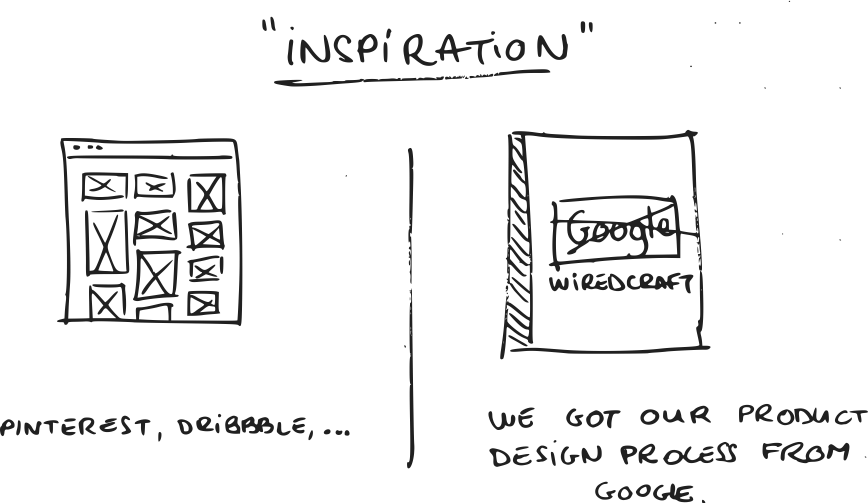
Our very product design process is actually heavily “inspired” from Google Ventures’ one.
C. Collaboration
Working with others
We believe in working online as much as possible, mostly because it makes things accessible and inclusive:
- Face-to-face meetings and conference calls are sometimes necessary, but they tend to be inefficient, requiring all participants to be available at the same time. We prefer working asynchronously, making it easy for people to take part, if and when they want.
- Digital content can survive and evolve into something ultimately useful. Post-its and fancy paper prototypes turn stale. Notes captured in a Hackpad have at least a shot at being recycled down the line.
- Finally, when you work online, people have an easier time to get involved into things that they weren’t specifically invited to. It is surprising how often one of us jump into a discussion on GitHub that they were notified of on Slack.
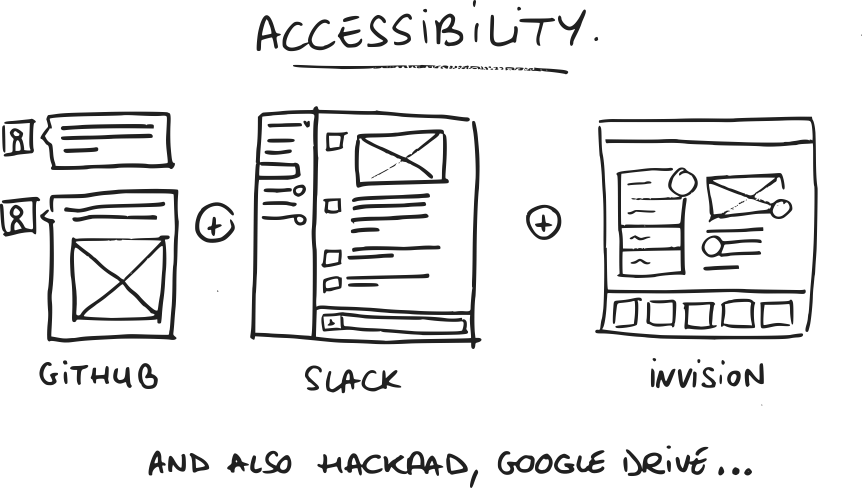
A few tools we use across the whole team;
- We use Slack for most interactions. It also integrates with many 3rd party services we use and provides a ton of useful notifications (e.g. new issue on a GitHub issue).
- GitHub is where we track pretty much everything: recruitment, marketing, development, operations…
- Google apps (Gmail & Google Docs mostly) for email, documents, spreadsheets, forms…
- Often times, we will draft documents on Dropbox Paper (e.g. client proposal or SCRUM notes).
- We use InVision to share our design work and collect feedback.
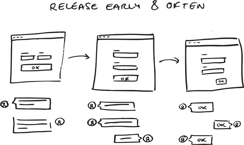
We share our work before we consider it done, polished or good enough. We encourage the rest of our team to give feedback as early as possible.
This leads us to much better solutions, much faster.
Good communications
Most efficient communications are organized in a similar way, may they be a blog post, an email or an issue on Github:
- Context; don’t assume people know what you’re talking about. Frame the context of your message, this helps people understand where you’re coming from.
- Teaser (optional); once you’ve set up the context, it is preferable to quickly outline what the core issue or idea is. This is especially true if it requires a fair amount of details to be explained.
- Development; stay concise and organized, for example using bullet points.
- Closing; always close with possible solutions, next steps or your conclusion. You’ve done all that work, chances are that you have an opinion about it.
D. Failure & Criticism
It’s hard to evaluate your own work. You need others to validate it. This is why we test & review as frequently as possible.
It usually starts with colleagues, and as we progress towards a final product we start expanding the audience, starting with demos to stakeholders and later on actual user testing. This is where data-driven design with things like A/B testing becomes relevant.

But failure doesn’t always look like it.
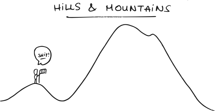
Sometimes, you worked really hard on something and got somewhere interesting. But in doing so, in reaching the top of the hill, you end up discovering the mountain that wasn’t visible when you started your climb.
And that usually means that you should go down the hill, and start all over again. And that’s hard.
This is why we try and mitigate sunk cost.
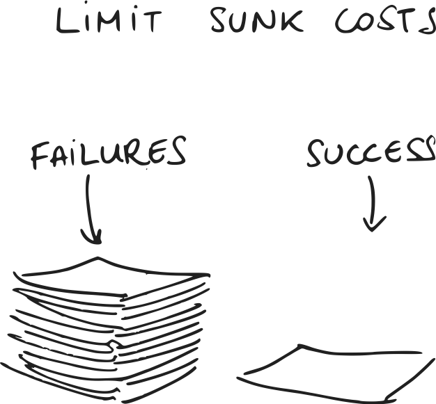
Using paper wireframes for example, we limit our emotional attachment to our work. It’s a lot easier to toss a piece of paper you doodled in 10 minutes than it is with something you spent 4 hours designing in Sketch.
It also has the added benefit of helping you manage expectations. For example, clients are a lot less likely to comment on details when you give them a low fidelity design.
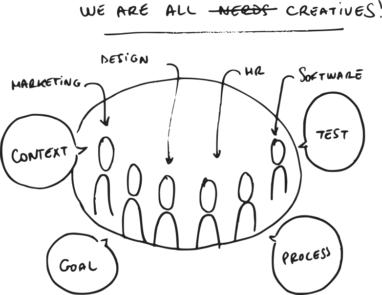
We are all creatives
Ultimately, you should consider everybody on your team to be a creative; whether you work in marketing, software development or HR, you speak the same language and have the same engineered creative process for solving problems.
The first step towards this is to open up; expose your creative process.

Once you do that, you’ll see you’ll naturally get drawn towards organizing it and improving it.
This talk was initially given at the UI/UX Conf we organize in Shanghai. I’ve embedded the video of my talk below, as well as a link to the free eBook.
Download the free eBook: creatives are Bullshit
Stay tuned
Follow our newsletter or our WeChat account; every other week you'll receive news about what we're up to, our events and our insights on digital products, omnichannel, cross-border ecommerce or whatever the team fancies.
-
Add us on WeChat

-
Subscribe to our newsletter