That Map Just Lied to Me
We love mapping data.
Urban, regional, national, global: maps we see on a daily basis on social media, at work, or on the news.
Maps are natural and familiar; you can easily read them and they are intuitive. You often skip any explanations and just understand the data.
Or so you think.
Since data is translated by developers and designers into data visualizations, data can sometimes be unintentionally (or intentionally) deceitful.
This is especially true for maps.
When Mapping Data Visualizations Fib
We are taught to be aware of gimmicks in advertising and speech. We know when we are getting sold something:
“It doesn’t get better than this. I had another couple in here looking at this so you need to make a decision now. insert sales jargon.”
It’s not so easy to identify when a map data visualization isn’t being so honest.
- They look reputable and we’re not used to questioning them.
- The titles can be deceiving. The data doesn’t match what the question is (ie. Where are magazines most popular? Might show you a population graph more than an answer to your question)
- Mapping the data is skewing the data. The map needs further clarification or the data should be presented differently.
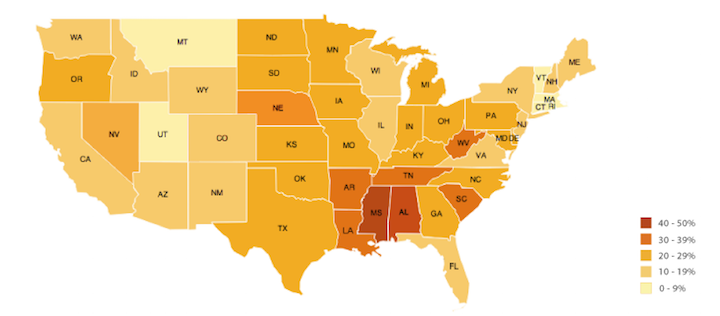
Take a look at this map and before you read on. Can you identify some problems with this map?
Problem 1:
Who cares about Hawaii, Alaska and DC? For a data set it’s probably important to have visualized all the US or if you are going to leave out parts, at least label and provide some documentation.
Problem 2:
Can you even see what percentage Rhode Island is? Let’s get out a magnifying glass.
Problem 3:
Delaware and Texas have the same percentage but Texas’ problem seems to have a greater weight because of it’s size.
These problems aren’t just limited to mapping the US.
In Asia you have size issues with Hong Kong, Macau and Singapore versus China. In Europe Monaco and Liechtenstein can easily disappear. What happens to half the islands of the world during mapping? You get the point. Small places lose their weight and importance when we map.
Take a look at mapping data visualizations and see when the map is lying to you.
In Map Veritas
How do you keep your maps truthful?
Know your data.
Be aware off the limitations of maps when you are developing your data. Answer the question “What’s the point of your data?” and make sure your data is explaining that. As a user check the data, the source, the question and think.
If you address these you will be on the way to better visualizing the conversation your data is trying to have with the user.
Because that’s the point of data visualizations: to communicate your data.
If you are struggling to know if mapping is suitable for your data. You can use this great guide from the Online Journalism Blog on when to use maps to visualize data.
If you love books: Check out How to Lie with Maps by Mark Monmonier.
Check out the Data Catalog for different ways to visualize data and the best tools to build them with.
Don’t worry. We still love maps. We’re not telling you to give up mapping your data anytime soon but consider the constraints of mapping during design and development to keep your maps useful and truthful.
Stay tuned
Follow our newsletter or our WeChat account; every other week you'll receive news about what we're up to, our events and our insights on digital products, omnichannel, cross-border ecommerce or whatever the team fancies.
-
Add us on WeChat

-
Subscribe to our newsletter