Don't Be a Data Viz Dummy
Data visualizations are everywhere.
Yet their expansive popularity doesn’t ensure that data visualizations are well done or even useful.
You can find entire pages dedicated to poorly crafted data visualizations. Our personal favorite is WTF Visualizations.
How do you stop this from happening to your own data visualizations?
Don’t be a data viz dummy. Read through these tips to build and better understand how data visualizations should look.
Don’t make it hard on the user
The user is number one. It doesn’t matter if your data visualization make sense to you and your team; if it isn’t clear to the user, it’s useless.
Make sure you data viz is comparable and consistent. If you have many data visualizations on a page, make sure that they work together so your user doesn’t need to re-adjust the margins for each new image. The best way to do this is to create a wireframe of your data visualization so you can review and prevent f!&k ups without investing a lot of time or resources.
Organize your data sequentially, alphabetically, by value.
Draw trends or provide context when needed. Users shouldn’t have to wonder why their was a sharp decrease in a visualization. Explain it to them.
Keep your data readable. Don’t overcrowd with plot points. Make sure that you are only using the pertinent data and not including excessive information that can draw attention away from your main point. This is more important for static visualizations, since you aren’t able to manipulate the variables yourself.
Follow normal conventions. Up and right is positive, down and left is negative. We all understand the desire to be creative, but breaking conventions makes it hard on the user and can hinder your data communication.
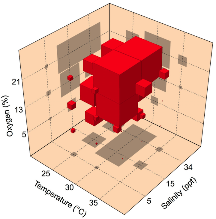
Don’t use 3D graphs to represent your data. 3D charts skew your perception of the data and are hard to read.
Avoid a Color Catastrophe
“…avoiding catastrophe becomes the first principle in bringing color to information: Above all, do no harm.” (Envisioning Information, Edward Tufte, Graphics Press, 1990)
It’s tempting to use rainbow colors in heat mapping for continuous data, but it makes your data difficult to understand. It’s much better to vary the saturation or brightness of a color to convey your data more clearly. Anna Li has a great post detailing heat mapping this on Poynter.
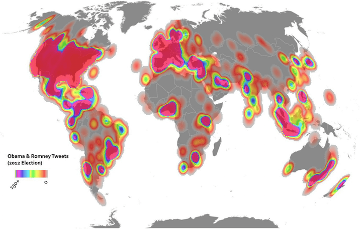
This map indicates the amount of tweets for the 2012 US election in a rainbow heatmap. (Image: Dr. Anthony C. Robinson / Penn State)
Stick to analogous colors. Add a complimentary or contrasting color as an accent piece to make your data visualization’s importance stand out or to identify relevant information.
Sequence your data based on color. The color density should match your data. The darker, more vivid colors representing a higher value and lighter, less vivid representing a lesser value.
Don’t forget the background color and label colors. You can change a data visualization drastically with your background. Make sure to keep the data understandable.
Check your color connotation. This might not be important for all data sets, but for some, you’ll need to think about color connotations. For example, if you are visualizing a car’s capability to stop from varying speeds, it might be better to use red versus green.
There are many resources on using color in data visualizations, especially from experts like Cynthia A. Brewer and Maureen Stone.
Transparency and Spacing
Make sure you can see your data. That means if you need to make your area charts or bubbles semi-transparent, do so. You’ll gain more insight to the information that way.
Share your data sources, or make your data open with CSV files or even better, APIs.
One of the easiest ways to mislead a user is to truncate or shift your axes (especially the Y-axis). Make sure to clearly label and identify when you are manipulating your axes.

Keep your data together. You don’t want your spacing too far or too close. The perfect spacing is considered to be 1/2 the width of your bar.
Be smart, plan your data visualization, and keep in mind the common problems you’ll face with bad data visualizations.
Stay tuned
Follow our newsletter or our WeChat account; every other week you'll receive news about what we're up to, our events and our insights on digital products, omnichannel, cross-border ecommerce or whatever the team fancies.
-
Add us on WeChat

-
Subscribe to our newsletter