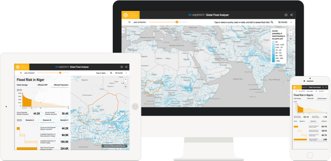
The Aqueduct Global Flood Analyzer Tool
Understanding and visualizing the impact and risks of floods worldwide with the World Resources Institute
Context
The World Resources Institute (WRI) is committed to promoting sustainable use of our natural resources.
We partnered with their Aqueduct team to build a Web tool for raising awareness of flood risks and climate change impacts. This was accomplished by visualizing more than a million data points related to river flood impacts and estimating the damage to GDP and urban populations.
![]()
Features
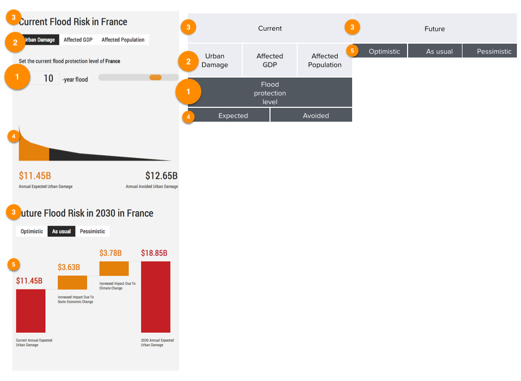
- Graphical and Map representations of current and future flood risks
- 3 different scenarios based on socio-political factors
- Global hydrological and hydraulic modelling
- Inundation modelling
- Impact modelling
- Estimation of “annual expected impacts”
- Future flood risk projections
Challenges & Goals
Goals
- Provide open and free access to a visual representation of the potential current and future impact of flooding.
Challenges
- Handling fat data. With over 1 million data points, the flood analyzer tool was needed to be analyzed and visualized.
- Data science at scale, between caching the calculations and on the fly calculations.
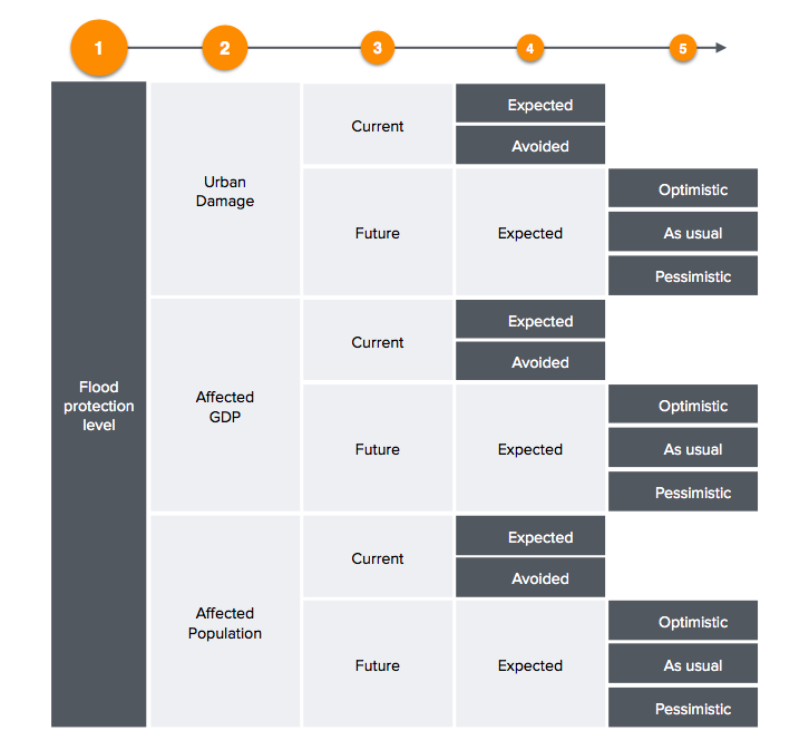
- Establishing hierarchy for information to give the user a clear explanation of the impact of investing in flood protection systems.
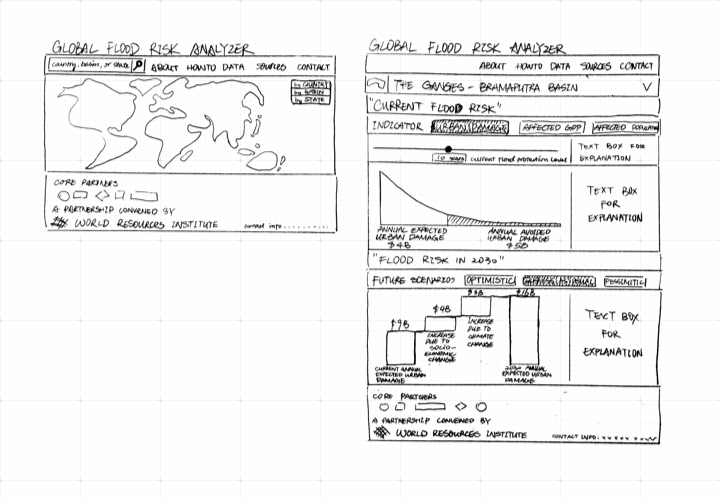
Design Processes
Cohesive Integration
The overall user interface and experience was designed for cohesiveness when integrating the application with the WRI website. A graph representing the impact of flood protection plans and the raw statistical data was jointly added. The original idea was to implement these assets on two separate pages.
Design Characteristics
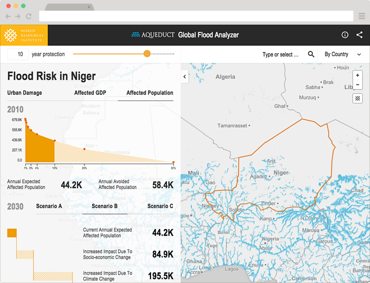
In order to provide the best user experience we would need to consolidate the application into a single page. We implemented non-intrusive design characteristics to create a distinction between the graph and map.
- Subtle gradient between map and graph
- Different type weights
- Foldable menu
Intuitive Navigation
As seen from our original wireframes we changed certain design formats to improve the user experience. The flood protetion selection bar is now fixed to the top bar, providing clearer access to the data. We also altered the presentation of the predicted data to align horizontally for clearer depiction.
Metrics
- April 2015 release
- 7 months
- 2 iterations, first prototype in 3 weeks and second iteration after 5
- 2800 assets including countries, states, and water basins
- 25x reduction in calculations
- Over 1 million data points
Technology & Techniques
- Efficiency and ease of use were the top priorities. We used Python APIs to seamlessly integrate with the WRI’s existing Python framework and libraries {numPY and pandas}. This choice eased the processing of such large datasets.
- Reduced processing times for large data. This was achieved by working with WRI directly and utilizing Redis to store pre-calculated data in caches.
- Customized maps with MapBox and Leaflet. Mapbox is a lightweight application we stacked on Leaflet, allowing us to easily map and control millions of data points and offer much better touch support for high performance on mobile devices.
- Data visualization with JavaScript. We used D3.js for our data visualization as it is the leading tool for fine-grained control of graphical elements.
Takeaways
- We tested our efficiency by working with the client during the design process to limit how much time we spent redoing wireframes and mock-ups.
- The team gained new skills in data visualization with Javascript to optimize our data calculations, resulting in faster processing times and better user flow.