Improve UX by evaluating the sign-up process
Improve user experience by exploring sign-up and log-in forms. When's the appropriate time to kill the form, and how can you make the process better
The start of my frustration with sign in forms was rooted in trying to copy and paste information from 360doc.com. When I wanted to copy a sentence or quote that I found really interesting to save for personal use, an annoying pop up form comes in. I tend to just leave the page and not come back, because I found this action to be annoying, and didn’t leave me feeling any trust for this site.

I spoke with my English speaking colleague, Katie, and although she didn’t have the same experience with English content she told me about her frustrations with being stopped to log in or sign-up after one scroll on many English content sites (albeit maybe not the highest quality sites).
No matter the language, timing and necessity of forms should be considered.
I’m a designer and an intuitive tech user; I pay very close attention to my online experiences and always rely on my instincts and personal tastes when it comes to online tools and applications. If I land on a page and it requires me to sign up right away before even being able to explore the content, I’ll close the page immediately and just move on (of course my patience for sign-in forms depends on my mood that day). I’ll be out of their even faster, if the sign-up form is ugly or complex.
If the sign-in process is too complex or doesn’t give me a sense of trust, then I won’t use their site or complete the process because I wouldn’t trust the owners not to spam me or share my email with spammers. As you learn when you are young first impressions matter, this is especially true when you are presenting your site. You can redo first-time user experience, especially this component of sign-up forms, is especially crucial and therefore, shouldn’t be bloated or inefficient.
Timing is everything
Pulling from my online experiences, a truly obnoxious onboarding experience goes like this: a user comes to the site and decides to purchase/download/comment on/search for something, but is interrupted by a call-to-action inviting (maybe requiring) the user to sign up for an account. That one small thing changes the user’s behaviour a great deal. In theory and practice, it’s a horrible UX design flaw to interrupt users mid-edit or mid-action.
Why you ask? Humans are so complex. The placement and timing of events in the sign-up process are crucial to guiding the user along to the desired action. Having bad UX is at this point inexcusable, as there are tons of resources and experts available.
As an essential component for account-based products, the how and when of registration are important questions to be considered when developing your sign-in process.
Different approaches
Forms
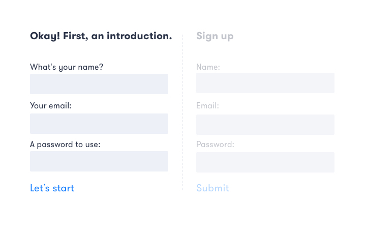
Both sign-in and sign-up forms aren’t always needed and they can be subtly distinguished from each other or rolled into a single form. It’s all in the design. It is worth mentioning that, to simplify the UX of sign-in/sign-up, some products merged the sign-in and sign-up forms, so the process became:
1. Enter your email
2. a. If the email match the registered database then enter your password and log in. b. If it doesn’t match the sign-up form copy appears.
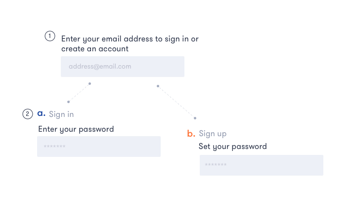
Although this is streamlined, this excessive simplification may actually cause user confusion rather than bringing helpful convenience. A lot of products gave up on this, like Evernote, because the steps were unclear. The key point here is the page copy should be clear enough to identify the steps needed to sign up or sign in.
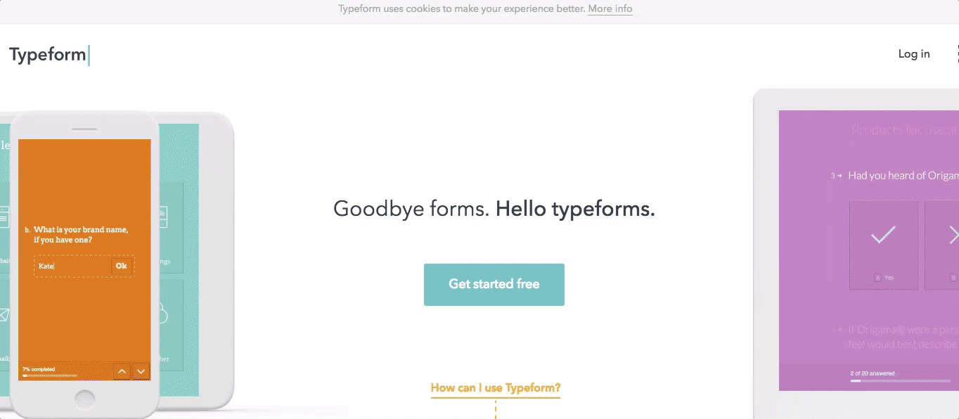
Try it first
Newbie and basic users are always welcome and unlimited. They don’t need to have an account until they start using the product in greater depth, usually creating an account is the last step in the process. For some tools and products, the new user should be offered a free trial or a default free plan without sign up.
Typeform is a great example of a product using this type of sign-in up. You can create your typeform and use the product, you don’t need to create an account until you decide to save your form. Typeform even has a code free form you can use on your site.
Forever remain anonymous
Enabling anonymous access and even editing powers is easy and convenient for a user, especially without forcing users to set up an account. Although this approach might not work for all sites, this approach is particularly useful for public content aggregates, like wikis that are open to all contributions. Most of the time, the users’ traits and qualities don’t matter, so the product owners shouldn’t care very much about who’s on their service.
Product Check-out requirements
With e-commerce and ticketing services, some element of the person’s identity are necessary to verify and complete the purchase, like an email address or phone number. For the transaction information collection is necessary, and not only benefits the owner of the page but also, enables the user to return and make queries about the purchases made. This type of transactional information does not necessarily require sign-up forms as there is a unique identifier to tie to the order/transaction like an email or a phone number. The user can retrieve their information by providing this email and some additional information like a confirmation number. Log-in and sign-up could be used, for example, to save searches or to store information for the next transaction. This is very common in many booking sites like kayak.com or qunar.com for the chinese market.
Associate with SNS account
Another frequent tactic is to connect new registrations with existing accounts, typically social networking sites, like Facebook, Google, Twitter, or LinkedIn if you’re looking for a job. This usually happens in two ways: 1.The product has mutual cooperation and interoperability with the SNS, especially if it’s a subsidiary.
- The product wants to collect your SNS information for its own purposes, then have the user fill in anything extra in a subsequent step.
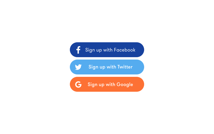
If you don’t require unnecessary access to an account information (like seeing friends list, or posting on user’s behalf), this is the preferred sign in method in my opinion. From analysis of the users’ mental models, the process of signing up is a kind of nudging design to tell people they’re joining an exclusive circle of people. After you experience the same series of “ceremonies” as everyone else, the ID you create will be the key to virtually everything else you do on that site, probably elsewhere too.
Deciding factors
I personally disagree with some of the anti-registration sentiment, to kill the form or not, I think it depends on, there are two points need to think through:
The product cycle
At the beginning of a product’s life, weaken the registration may help to increase user base. More established and mature products can always drawing big crowds whenever they show their registration.
The product form
News, news feed, tools etc. they could let the users see the content first, and even participate in some advanced functions like sharing without needing to log-in. The log-in process could be reserved for saving, and sorting features. For Social product, get user be involved at the first time may help remain them for a long term. For e-commerce website, user’s registration info could always be collected at the key point (always be the last step).
To improve
Although the way to improve depends on the case-by-case situation which you can identify through design sprints , it can be summarized as follows:
Keep things simple and designed
Avoid collecting unnecessary information from the user, have more instructive text for your process may make your forms a speedy process.
Show the registration at the right time
Pay attention to timing when requiring users to register, build trust and never require users to sign up as their first interaction with your site.
Always make it reasonable to make an account
Kill the form,when it’s unnecessary. As a designer, don’t be afraid to challenge the marketing team or decision makers at this step, make sure they are considering the user when collecting information.
Registration for your product could and should be pleasant. More and more sites are paying attention to their users and understanding when it’s appropriate to collect information, and what information they should be collecting. Building trust and establishing a rapport with your users should be the first thing you keep in mind when creating your sign in form.
What are your thought’s on sign-in/sign-up forms? Let me know via on Twitter.
Stay tuned
Follow our newsletter or our WeChat account; every other week you'll receive news about what we're up to, our events and our insights on digital products, omnichannel, cross-border ecommerce or whatever the team fancies.
-
Add us on WeChat

-
Subscribe to our newsletter