UX Design Clichés Revamp on WeChat E-commerce Mini-program
Learn how we design and improvise to create a more effective user journey for brands on WeChat e-commerce mini-program.
It’s been 5 years since Tencent has rolled out its superb cloud-based app - WeChat mini-program. The app has achieved 450 million daily active users in 2021 which made it incredibly lucrative according to the statistics. Compared with other mini-programs or third-party e-commerce platforms (JD and Tmall), brands favor building their own WeChat E-commerce(EC) Mini-program because it empowers them to drive traffic within WeChat ecosystem to their own e-commerce digital space to design their own campaigns and promote products.
To seize this considerable opportunity in China with the ultimate goal of creating an efficient yet meaningful customer journey that could earn solid ROI, brands have partnered with Wiredcraft to improvise the WeChat mini-program according to their brand culture while meeting user expectations.
As Chinese online consumers are increasingly expecting a more user friendly yet more immersive purchasing experience, our team has redefined its UX design tactics to ease purchasing experience. These tactics include streamlining user pathways to products, leveraging valuable content and integrating brand experience.
Streamlining user pathways to products: HARMAY maximizes usability
Mini-programs are designed for simpler tasks such as guiding users to browse and search for desired products instantly. Hence, the design and features should be intuitive and prompting users to relevant product selection through easy navigation.
Before investing in any execution process, we should always identify who is the target audience as their needs determine the format and design. HARMAY, as a giant Chinese multi-brand beauty retailer we have worked with, stands out with its own aesthetic, artistic, well-crafted interiors, now owns 14 physical stores in China. Consumers enjoy the immersive and convenient cosmetics shopping experience where they are able to find all that is necessary. HARMAY has strengthened its digital presence immensely with over 8,000 SKUs (Stock Keeping Units) on their EC mini-program. The product category covers skin care, cosmetics, fragrance, body care and etc. from different brands which users found overwhelming when browsing the original product catalog. A research also shows that users encounter difficulties when shopping for products that are offered in multiple variants (i.e., different sizes, colors, prints, materials). This is where our design team comes in to solve the usability issues for better experience.
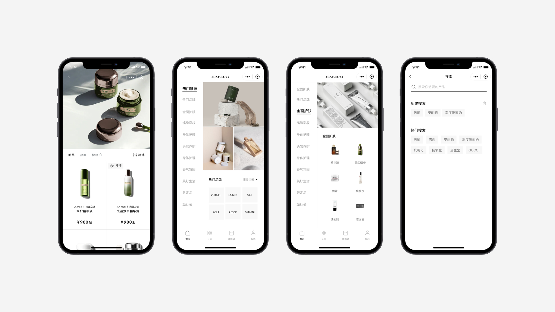
First, we have opted out the original waterfall design - users have struggled with scrolling down the page to load more search results. Considering that users are not familiar with all products that HARMAY offers, the new design of product catalog exists to not only help users find specific products, but also serves as an introduction to the broad mix of products from their local and international niche brands.
For reading convenience, we have simplified the display by coming up with two side navigation that is aligned with F-pattern scanning. The hot sale items are displayed as a banner that prompts users to the product landing page for more details, while subcategory images with description are added to the subcategory display to be more eye-catching. The redesigned flat product catalog has helped users to quickly navigate to their interested products.
Furthermore, the enhanced search and filter feature embedded at the top navigation bar has allowed users to narrow down their specific needs for products directly. Users are now able to search using text and results that will be displayed if the text matches the values in several product attributes including name, color and collection and more.
Leveraging valuable content: Zara enriches user purchasing journey
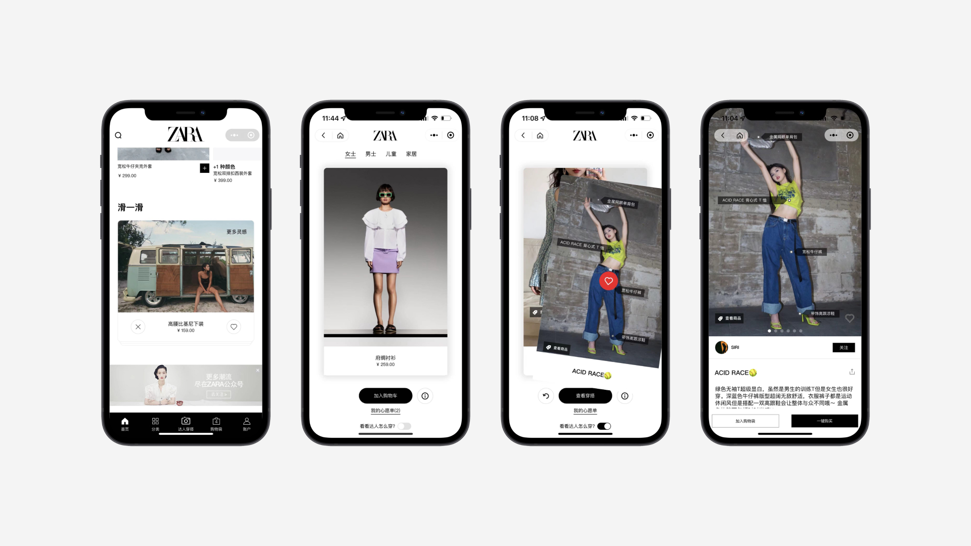
As online shoppers value convenience, we have worked collaboratively with Zara to design a compelling and effortless purchasing journey that leads to more conversions.
Besides adding products to the shopping cart, users are now able to make instant purchases with the “one-click checkout一键购买” feature that we have placed on Zara EC mini-program’s product detail page. Our team has also opted out the original “Swipe 滑一滑” feature to learn more about outfit inspiration under the checkout page that was almost undetectable due to the smaller icon without visual impact. Instead, we added more visuals with a card design that contains featured outfit images which are more captivating and tapped into the real interest of users.
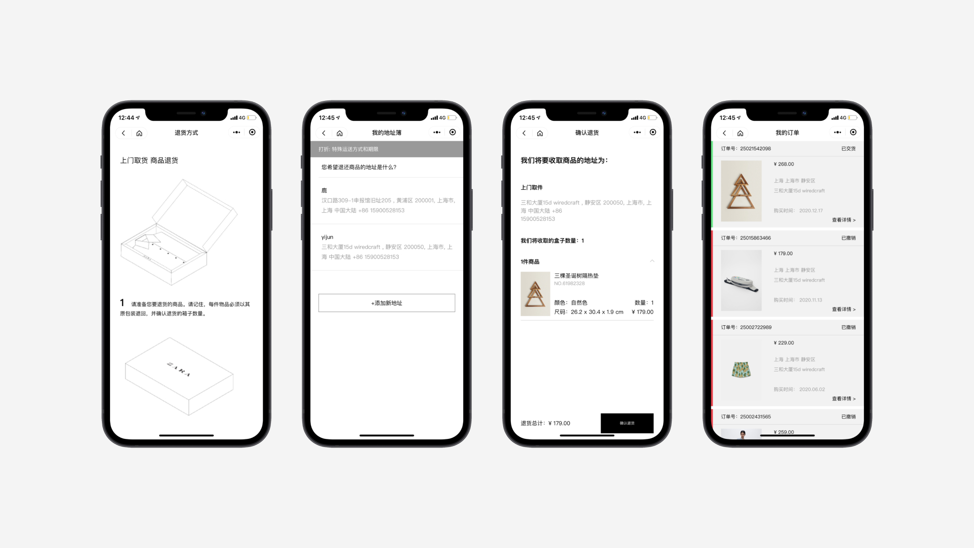
As for the after-purchase service, many users found the refund process on the majority of the existing EC mini-programs to be long and perplexing. They would have to submit their refund request on a separate page, pack up the unwanted item and go to the designated courier to fill out receiver information for shipment to complete the return. To eliminate the redundancy, Zara had partnered with us to design a consistent and smoother refund process. From just selecting items on the Return Order page to applying autofill default address saved on their account when booking slots for the courier to pick up the refund order - with only a few clicks the return process can be finalized within the app. This efficient return process will improve customer experience and help with customer retention, leading to increased brand loyalty.
Integrating brand experiences to resonate with users
To stand out among competitors in a rapidly evolving digital e-commerce world, business growth is not just about the ability to achieve short-term sales results but the ability to continuously meet customers’ expectations with an end goal of ensuring retention and conversions. To inspire consumers to choose their own brand over others, brand experience becomes more prominent. A consistent and unique brand experience satisfies users’ desire to forge an emotional relationship with the brand, forming an internal belief in brands and naturally drives more sales. Thus, it demonstrates why more brands have chosen to morph traditional EC mini-program design - a bald product assortment displayed into a consistent and appealing brand space.
 Photos by: Unsplash
Creating such a brand space on an EC mini-program takes effort. Partnered with different brands, our design team have exploited some effective tactics that are appealing and authentic to users.
-
Enhancing brand image: Establishing a strong brand image sets the rivals apart. Blending brand culture and story into the product page enhances the brand value that resonates with consumers. By designing an authentic storyline for product pages, users experience a seamless journey that is surrounded by brand DNA - starting from learning each product story and followed by more detailed product information down the page.
-
Crafting visual storytelling: A compelling visual storytelling speaks for brand identity and evokes certain feelings and guides through consumers’ experience with the brand. Instead of listing all the products on a single page, our design team utilizes various visual elements in an intuitive manner such as: full-screen slideshow that contains appropriate images, colors, and videos when users land on the homepage - to completely immerse them into a digital brand space.
-
Keeping consistency: Consistency matters, it helps people recognize a brand. The rule applies to logos, colors, imagery, typography, marketing content, voice of communication and messaging. Our design team worked collaboratively with clients’ marketing team to use brand digital assets for trending marketing campaigns and ensure consistency across all channels.
Wrap it up
At Wiredcraft, we design for effectiveness, we care about user experience, we value our partnership and we also embark on new challenges. Despite being progressively obsolete, the original UX design tactics are common practices in e-commerce mini-program design. They are the solid foundation that have enlightened our solutions towards effective design while preventing us from derailing during the design process.
Stay tuned
Follow our newsletter or our WeChat account; every other week you'll receive news about what we're up to, our events and our insights on digital products, omnichannel, cross-border ecommerce or whatever the team fancies.
-
Add us on WeChat

-
Subscribe to our newsletter