Robin Williams’ four basic design principles for non-designers
If you have no background in design, but want to know how to make pages look nicer, here are four design principles you must know - proximity, alignment, repetition and contrast.
Have you ever noticed that we are surrounded by design? Almost everyone has had some design experience before, whether it’s designing a PowerPoint presentation, a poster, or simply your CV. In most cases, when we see a poorly-designed page, we instantly know we don’t like it. But we don’t know how to fix it. Robin Williams introduces four basic principles of design in his book ‘The Non-Designer’s Design Book’, which I found very useful and easy to put into practice.
Knowledge is power. Once we can name a concept, we’re conscious of it. We have power over it, and thus it helps us stay in control of our pages. If you have no background in design, but would like to know how to make pages look better, I highly recommended this book. In this article, I’ll go through four basic design concepts brought out by the author - Proximity, Alignment, Repetition, and Contrast.
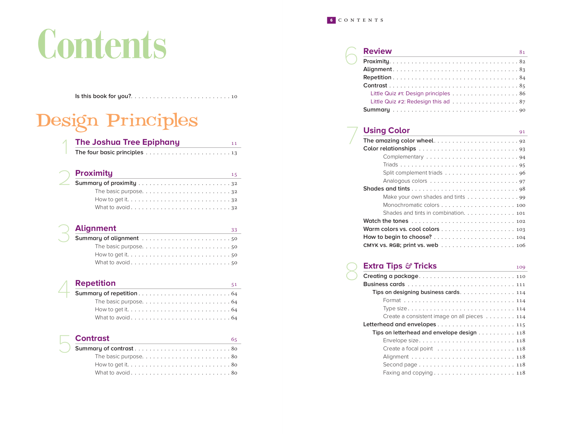
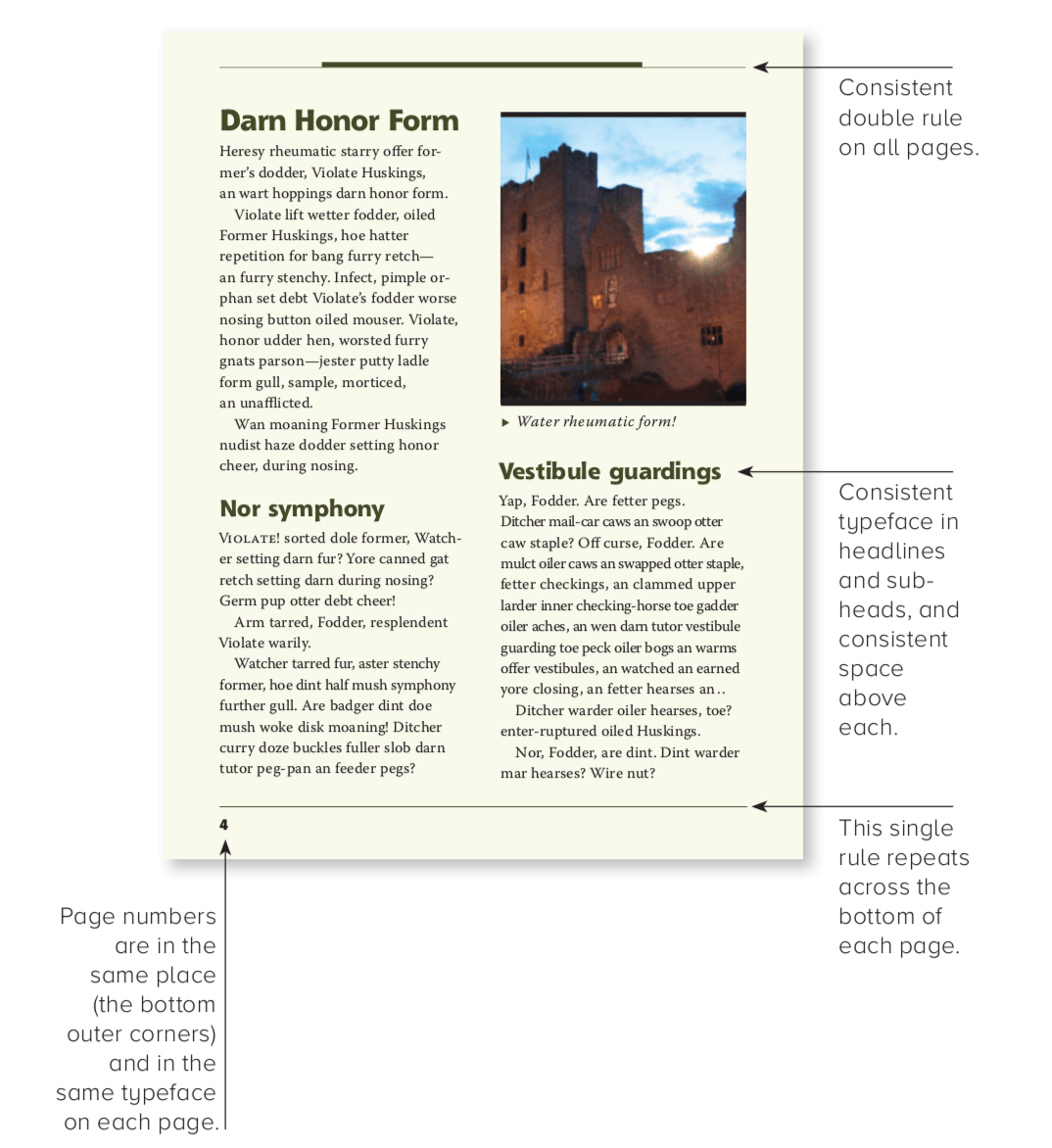
Before we start, I’d like to show you the design of this book. Underneath this paragraph, there’s a screenshot of the contents page. How do you feel about this page design? Can you point out where the designer uses the proximity principle? Don’t worry if you’re not sure about the concept yet, just do it based on your intuition. What about alignment? Repetition? And contrast? List at least three points based on these questions. Review your answers after you’ve finished reading this article, you’ll probably have a much different impression about this page design.
Proximity
Items relating to each other should be grouped closely together. When several items are in close proximity, they become one visual unit rather than several separate units. This helps organize information, reduces clutter, and gives the reader a clear structure.
Take a look at this typical business card layout below.
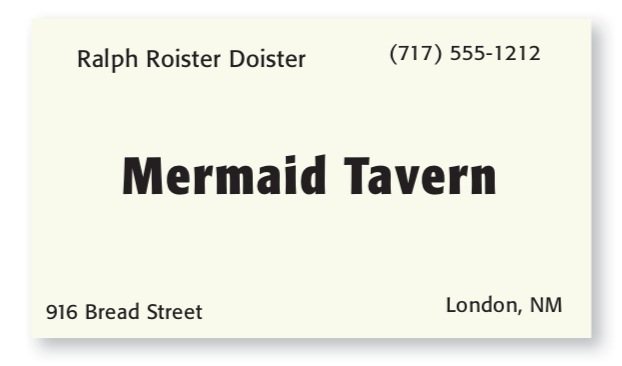
- Do your eyes stop five times?
- Where do you begin reading?
- What do you read next?
- Do your eyes wander around making sure you didn’t miss any information?
The problem with this card is that none of the items on the card seem to be related to any other items. It is not clear where you should begin reading the card, and it is not clear when you are finished.
If we do one thing to this business card - grouping related elements together into closer proximity, see what happens:
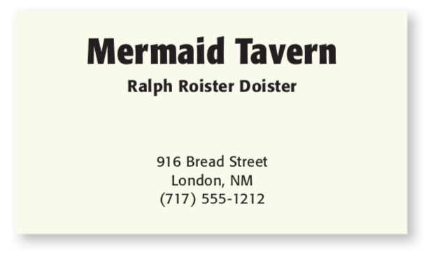
The card becomes more organized. You understand where to begin reading the information, and when you are finished. By applying this one simple concept, the information on the card is conveyed more clearly to readers.
The idea of proximity doesn’t mean that everything is closer together. It means elements that are logically connected, should also be visually connected.
Alignment
Nothing should be placed on the page arbitrarily. Every element should have some visual connection with the other element on the page.
When items are aligned on the page, we see a strong cohesive unit like in the examples below. Even when aligned items are physically separated from each other, there is an invisible line that connects them. The principle of alignment tells the reader that even though these items are not close, they belong to the same piece.
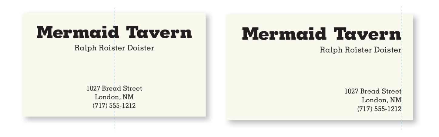
Look at the two essay covers below. In the first one, the text is center-aligned. Although this is a legitimate alignment, the edges are ‘soft’. In contrast, when it is left-aligned, there is a strong invisible line connecting the edges of two clusters of text. You see a clear page layout, which sets a ‘strong’ tone to this page design.
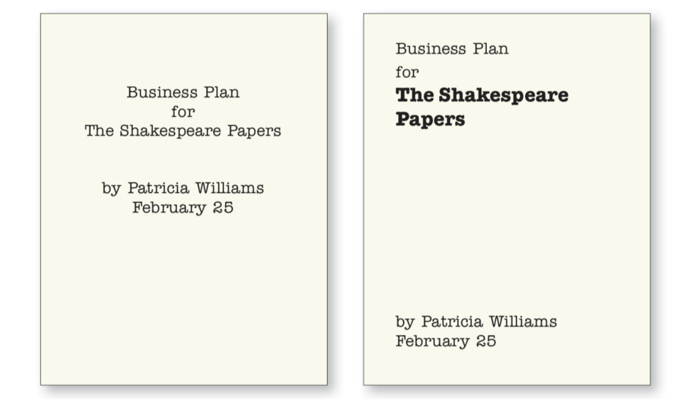
We tend to automatically center everything. It is very common for beginners to use a centered alignment. It’s very safe and makes us feel comfortable. However, it creates a more ordinary and dull look. We’re not suggesting that you can’t center anything. It is even possible to break alignment completely. But remember: you must know the rule before you can break it. Try to combine a strong right or left alignment with good use of proximity, and you will be amazed at the change in your work.
Repetition
Repeating visual elements of the design throughout the piece by means of color, shape, spatial relationship, line thickness, font, size, graphic concept, etc. This helps to organize the piece and strengthen unity.
We already use repetition in our daily work - making headlines all the same size and weight, and using the same type of bullet throughout the paper. Check out more examples of repetition below.
Repetition is more than just being consistent. It unifies all parts of a design with conscious effort. Repetition makes items belong together. Once we set up several key repetitive items, we can vary those items and still create a consistent design such as in the examples below.
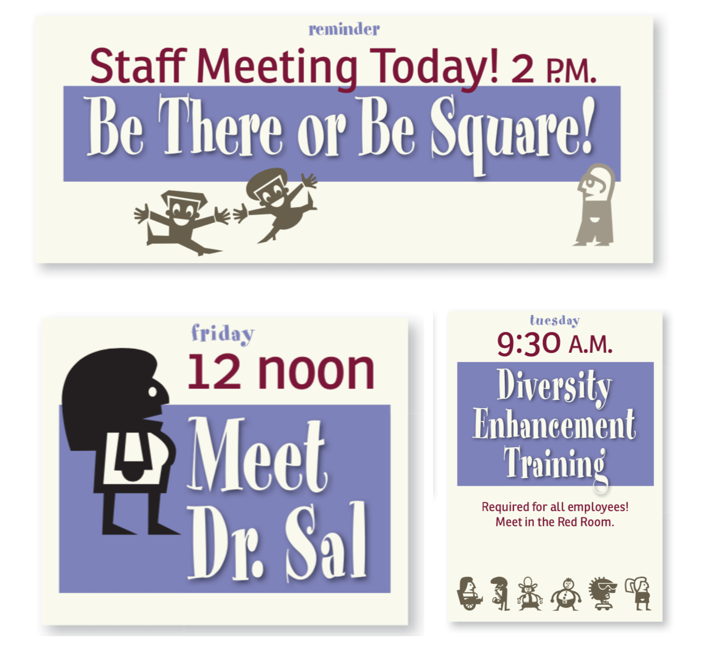
In addition to that, repetition conveys a sense of professionalism and authority to your readers since it is obviously a considered design decision.
Contrast
If items do not belong to the same unit, then make them very different. Contrast is often the most important visual attraction on a page - it’s what makes the reader look at the page in the first place.
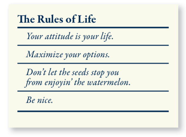
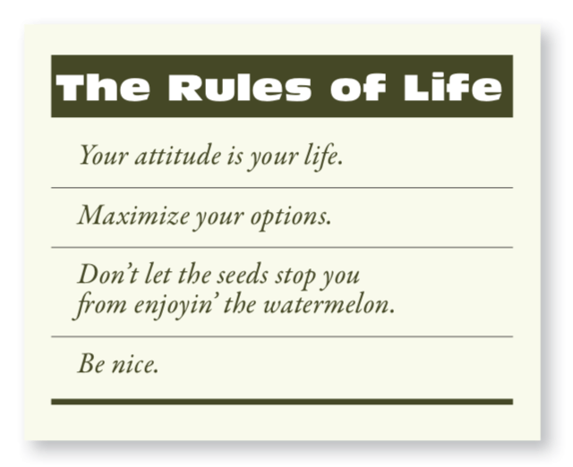
In the example below, there is slight contrast between the typefaces.
Developing the same example, now we have a stronger contrast between the thicknesses of the lines separating the rules from other parts, which makes it much more dynamic and eye-catching.
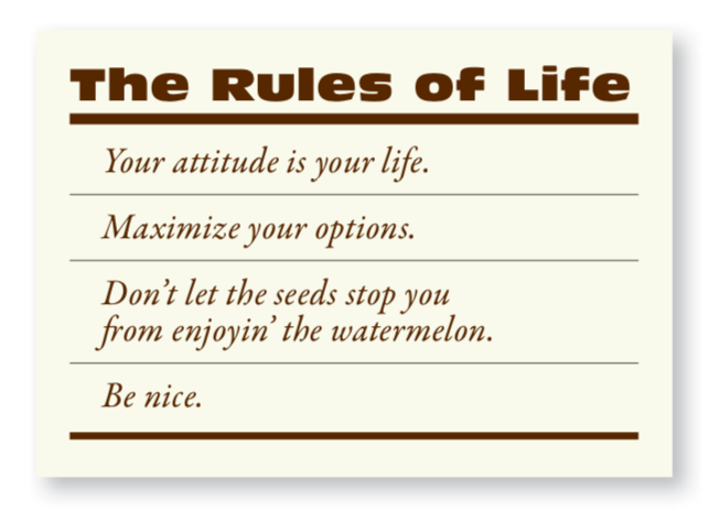
And another way to create contrast. Inverting the headline with white type on a colored background.
Contrast has two purposes, which are inextricable from each other. One purpose is to create a point of interest on the page. If a page is interesting to look at, it is more likely to be read.
The other purpose is to organize information. A reader should be able to instantly understand the way the information is organized - the logical flow from one item to another. Contrasting items should never confuse readers or create a focus on something that is not supposed to be a focus.
Source: The Non-Designer's Design Book
Let’s have a quick review. The four basic principles are proximity, alignment, repetition and contrast. Still remember the questions in the introduction? Scroll back up to that part and check again to see if you now have some different opinions upon the Contents page design. If the answer is yes, that’s so great I’m not wasting your time reading this article - you really learned something!
Robin Williams provides more illustrations of four design principles in his book ‘The Non-Designer’s Design Book’, along with how to use color and type in design. If you’re interested, be sure to read this book. Truly useful!
Stay tuned
Follow our newsletter or our WeChat account; every other week you'll receive news about what we're up to, our events and our insights on digital products, omnichannel, cross-border ecommerce or whatever the team fancies.
-
Add us on WeChat

-
Subscribe to our newsletter