New GA tools: a first look at advanced analysis and signals
A brief walkthrough on two new Google Analytics tools, currently in beta, and how they can help you to better understand your data.
With our dedicated Data Intelligence team at Wiredcraft, it’s important to keep up with new developments in our data science tools. We recently did a bit of research on these two new GA tools that have been rolled out recently (both in beta), and thought we’d share the knowledge we gained for anyone else interested. (hello, fellow data nerds!)
Unfortunately, Advanced Analysis is only available to 360 accounts for now, but Signals is rolling out slowly to all GA accounts.
Advanced Analysis
While this tool mostly uses data that has always been available in GA through Custom Reports, it’s much more user-friendly now, with settings down the left hand side and a instantly updating report window on the right that you can drag and drop values into. This is much more intuitive than Custom Reports’ method of selecting all your settings upfront and waiting for the report to load on the next screen (let alone flicking back and forth editing if it wasn’t quite what you wanted!)
Think of it as a cross between Google Data Studio and the Custom Reports feature, combining great features from both, but not replacing one or the other.
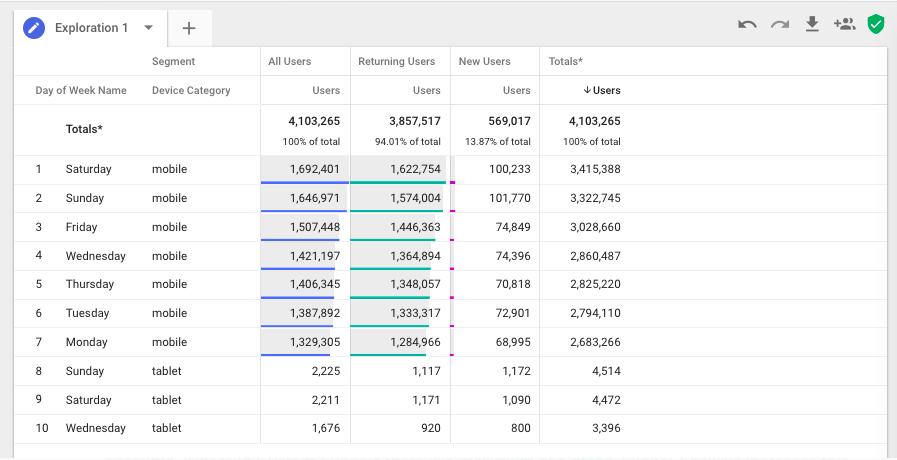
Exploration
Instant visualizations of your data - you can add dimensions, metrics, and even segments onto the canvas. Combining all this data into a single view makes it much easier to compare and track changes.
You can switch between several different visualizations depending on which best fits your needs - table, pie, and line charts are the current available options.
The way that this feature is structured makes it easier to start with a simple report and add multiple layers to explore anything that looks interesting. You’re limited to 4 segments, just like in Custom Reports, but the added chart visualizations make it easier to spot any interesting insights. Data Studio has many more visual options, of course, but you’re limited to one segment.
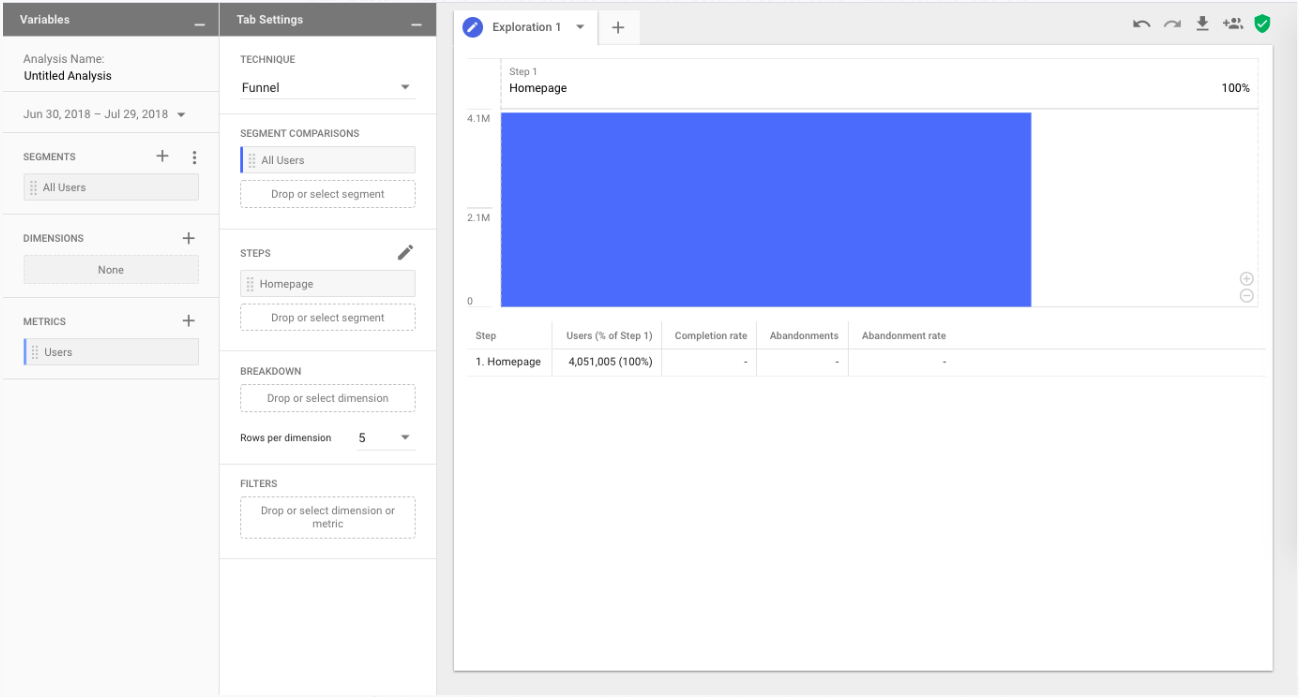
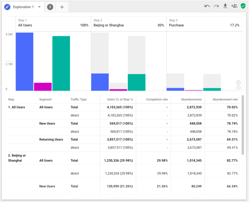
Funnel Analysis
This adds extra capabilities to the existing Custom Funnels report that was available to 360 accounts. Where in Custom Funnels there is a maximum of 5 steps, Funnel Analysis increases this to 10 steps, giving you a more granular understanding of how customers are flowing through your site or app.
Dimensions and multiple segments can also be applied to these funnels, allowing you to compare and contrast how behaviour may differ between these audiences. You can also instantly create segments from drop-offs, as well as apply additional filters.
The biggest advantage of this feature is that it can be applied retroactively. The Funnel Visualization report in GA is dependent on an existing goal, so if you don’t already have one set up to match the funnel you’re interested in, you can’t use this report and will have to manually calculate drop-off and conversion rates yourself.
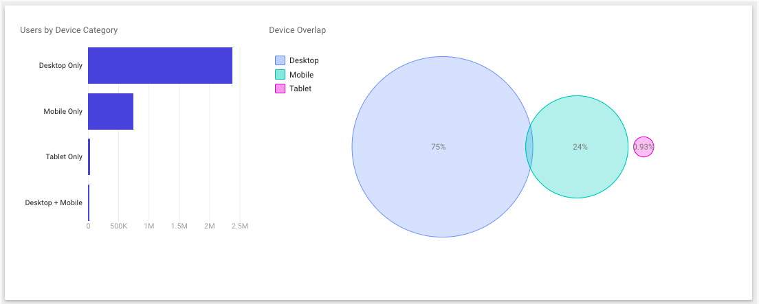
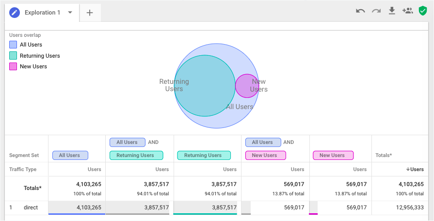
Segment Overlap
Presents a visual representation for you to see how much different segments have in common with one another by plotting each segment on the canvas, and overlapping them Venn diagram style according to how similar they are.
As you can see from all these reports, they are very focused on data exploration, rather than data visualization. The idea of Advanced Analysis is to visualize your data just enough to see where there are interesting insights that should be further investigated. Right clicking on a subset of users at any points allows you to create a segment for investigation, or an audience to remarket to.
Google Signals
The main purpose of Google Signals is to track cross-device journeys from the same user, and to enhance remarketing by building smarter audiences. Think of it as an aggregated User Explorer report. The idea behind it is to optimize your marketing campaigns based on the total customer experience.
Why bother to track users across devices?
- Aggregated data: the ability to link up cross-device sessions. Rather than two sessions that resulted in $100 worth of transactions each, you can see that it’s just one customer who converted two times - once on mobile, and once on desktop
- Customer journey insights: understand where customers are in their journey, even if they switch devices
- Optimize marketing campaigns: gain insights into where best to try and reengage customers, or plan a marketing campaign based on the total number of cross-device sessions
Data is only shown for users who are signed into at least one Google service (Gmail, YouTube, Drive etc.) and who have also turned on Ads Personalization. The user is tracked from their first interaction (either through visiting directly, or clicking on an Ad), across all signed in devices. All intermediary actions are also tracked.
For example, now you will be able to connect up when a user visits your website or app over several sessions and devices. If you’re noticing a lot of new user traffic on desktop, but see that customers ultimately choose to purchase via mobile, you can plan your campaigns accordingly so that you are speaking to customers in the right stage of the shopping cycle and engaging the customer with the right message at the right time.
Reports
There are four different cross-device reports that Signals activates. The important thing to note for these reports is that they all use sampled data, and will not show data if there are not enough users to hide individual users’ identities. The reports available are:
- Device Overlap: shows the combination(s) of devices used to access your site, and how many users overlap in their use across devices
- Device Paths: shows the device sequence used before conversion, so which device is used when they are first acquired, and which device(s) they choose to use subsequently
- Channels: acquisition, behavior, and conversion metrics by selected dimension. Note that this report uses the Last Non-Direct Click attribution model, so the device that was used for the conversion is given credit
- Acquisition Device: the device on which the customer is first acquired, along with session, revenue and conversion data
Stay tuned
Follow our newsletter or our WeChat account; every other week you'll receive news about what we're up to, our events and our insights on digital products, omnichannel, cross-border ecommerce or whatever the team fancies.
-
Add us on WeChat

-
Subscribe to our newsletter