Mood board, a tool or a trick?
How to communicate in visual language during a design process? We speak in “Mood Boards”.
There is no surprise that converting abstract ideas into relevant visual references is a tricky task. It’s also time-consuming to manage endless change requests without an aligned design direction. In that case, what method should be adopted to ensure your design efficiency and quality while being able to clearly express the logic behind it, as a means to gain design approval from either clients or stakeholders?
This article will be illustrating how our design team creates mood boards to transform abstract feelings into concrete visual content and establish a design direction.
Before we start
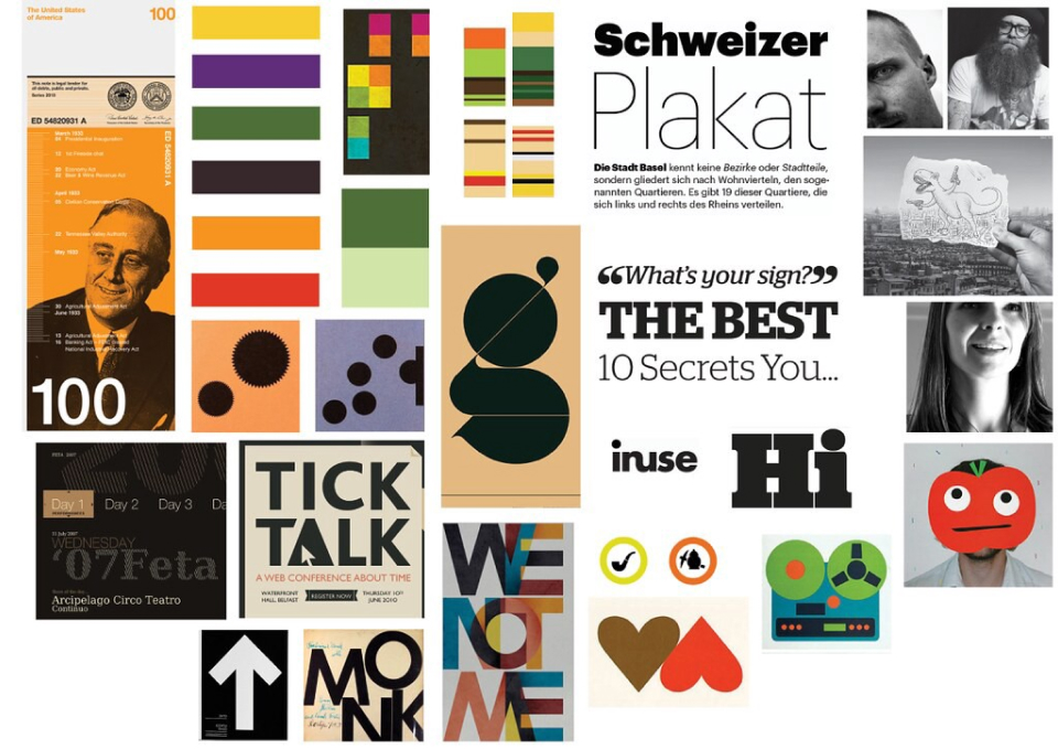
Imagine you are designing a featured image for this blog post. What will be your standard design process? You are most likely to follow the brand guideline when creating an image inspired by illustrations that are simple, geometric, flat and abstract (a.k.a. Swiss Style).  source: flicker
When you presented your work to the stakeholder, you were questioned by ‘Why are you using this arrow? Why are you using this background color? Why are you using a blue square?’ You should be able to explain the rationale behind your design decisions.
From simple designs to complicated design deliverables of a digital product, you would always need a tool to set an overall visual direction. This is where a mood board comes in.
Why do you need a mood board?
Mood boards are visual documentation combining visual elements such as images, colors, typography, icons, etc. We use it to capture the ambiance of a digital product and define a visual direction.
Having a mood board at the beginning of the design process will unify creative directions for achieving a product goal during design sprints. It is a tool to be used in:
- Communication: A valuable tool to communicate with stakeholders and teams. It reduces friction and time when making decisions. Even a tiny little tweak to the logo should be reflected on the mood board to explain why the decision has been made.
- Analysis: An in-depth analysis of design requirements that allows stakeholders to have a deeper understanding of product types, end-users and product goals.
- Visual Guidance: A visual guideline by outlining design principles to determine the design direction. It can be accessed both internally by the team and externally by clients to create a visual design guidance.
You should use a mood board when you:
- start a product design from scratch,
- revamp an existing product,
- work on rebranding purposes (To define a new visual branding style)
How to create a mood board?
Our design team follows 3 steps:

Step 1: Keywords “Brain dump”
We start by defining the primary keywords from 5 fundamental aspects of a product at the discovery stage during our design process. Let’s take a lifestyle application as an example.
- Industry: Technology.
- Brand: Offers professional, smart, and sustainable digital products.
- Product positioning: Sustainable, efficient, simple and consistent.
- User research: Professional users who prioritize efficiency and utilize apps in daily life.
- Market research: Whether it’s chat, social, search, entertainment, home, lifestyle and more, users enjoy the smart and simple ecosystem.
This information will usually come with a briefing from your strategy team. A keyword sheet would be a great tool to start with, to collect, filter, and categorize all of your findings. Generally, choosing 3-5 keywords for each category and the keywords should be strongly associated with the brand style guide and product features.
Step 2: Kick off a mood board
Before creating the mood board, our design team would start an initial design audit on the existing assets from the brand book, including typography, color schemes, icons and imagery. If the brand book were not available, you should start by reviewing and evaluating the current design solutions from both online and offline platforms to have a grasp on the brand identity.
Start visualizing the keywords from step 1 by searching for related images. Nothing beats visual reference in attempt to illustrate “feelings”. Start looking into the essential design elements: colors, layout, font and icon as they enrich your findings from a larger scope.
The most common resources that you could get inspiration on are Pinterest, dribble, Behance, awwwards. Additionally, don’t forget to check out Instagram for more branding inspiration.
And now, it’s time to fire up your mood board.
Mood board tool: It doesn’t really matter if you lean on some other tools such as Photoshop. Nevertheless, Figma is a favorable option as it is a collaborative design tool that we use in our entire design process.
It is crucial to see the context before starting the work itself but nothing beats user feedback. Talk to your users by showcasing your findings with proper keywords and visual references. Is this the right path to meet your goal? Does this align with your brand guideline? Listen to their feedback, and refine your keywords and visuals repeatedly if necessary.
After several rounds of feedback or a workshop, you are able to narrow down the preliminary to just a few critical keywords that would define a more precise visual direction. This will align with your client’s vision and any design adjustments made should be reflected on the mood board as well.

Step 3: Keep “Mood Boarding”
A mood board should trigger intended emotions or serve a purpose. If it doesn’t, you should iterate your board.
We all have a different understanding of abstract terms in the sense that people have different perceptions. As a result, the current images we have discovered may not cover every aspect. For example, what does it mean by “sustainable” in terms of a product? You may have various images of physical products such as an eco-light. But, what is the main purpose it serves for?
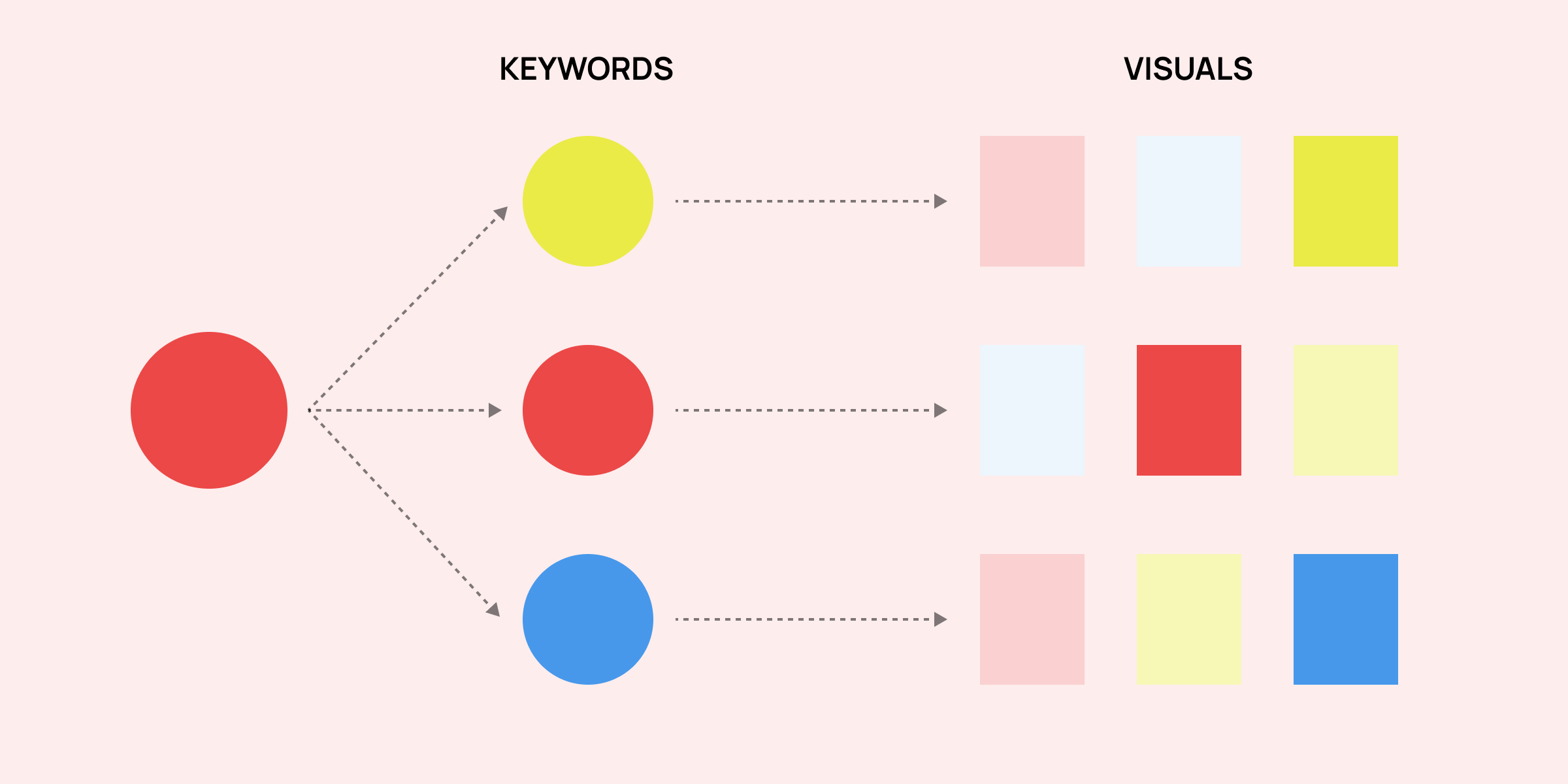
Your clients are not creating an eco-light but a digital product for their brand. You probably need a lot more images to clarify what “sustainable” means to their product. That being said, you need to think about “sustainable” in visuals, “sustainable” in mood, and “sustainable” in tangible objects. Mapping keywords from the last step will cover and filter all possible angles of a product’s desired look, ending as a product that meets your users’ needs. Keep mood boarding until your team lines up with an explicit idea of its tone and feel that would ultimately lead to the design principles.
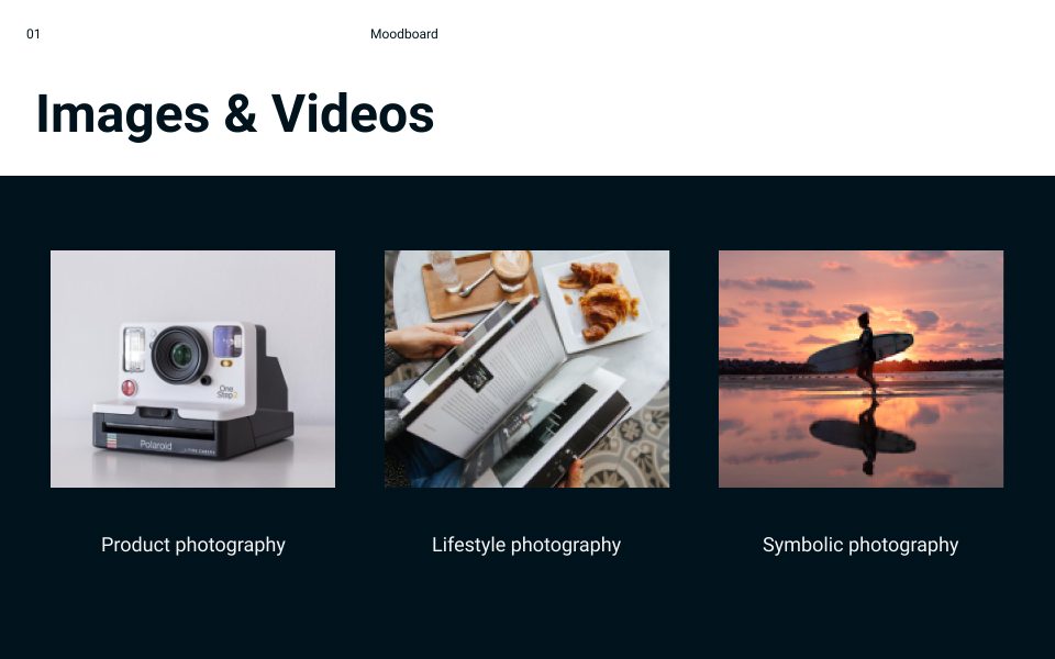
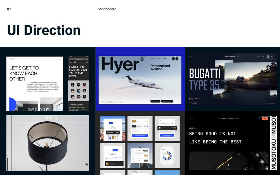
Alright! We are finally at the end of the tunnel where we get to glance at parts of our well-designed mood board. Having the keywords mapped out, you are ready to set visual styles in colors, typography, photography and layout. You could add on icons, videos or animations along the way to keep your mood board up to date.

Next, what about design principles?
Ultimately, a mood board helps a design team to convey numerous abstract decisions that impact the design direction. Every image should serve its purpose on the mood board. Keep asking yourself why the specific image is added as opposed to the other, this will definitely help explain to your clients on every design decision made.
In our case, we define the overall design direction to be simple, efficient, consistent and sustainable. And the rule will be applied to designing all visual components with regard to colors, typography, imagery, and layouts. This is how to establish Design principles.
Voilà. You will now be able to tell stakeholders why I am using this color, this and that.
Wrap it up
A Mood board is the new best thing since sliced bread. Creating mood boards ahead of your design project would speed up the overall design process. The mood board is one of our design deliverables that will be used throughout the entire product life cycle. We will also be sharing more information about other Wiredcraft’s design deliverables in the future, including design principles, design systems, etc.
Drop us a line now to leverage our design expertise and kick off your next design project.