Human-Centered Design Is A Waste Of Paper

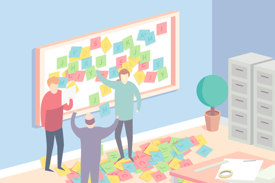
Let me repeat it: Human-Centered Design is literally a waste of perfectly good paper. The folks at Wiredcraft are 100% aligned with the overall goals of Human-Centered Design (HCD), and we apply many of its concepts when working on products. But there is a pervasive trend among the design community to associate HCD with nice colored post-its and walls covered in printouts of wireframes. It is at best inefficient, at worst polluting the design process.
The problem with HCD
Again, HCD is valuable. I can’t think of a single product we would have worked on that hasn’t benefited from us thinking and designing the product first and foremost for its users.
In practice however, we hear and see a lot more about the gimmicks than the underlying philosophy. I see walls of pink, blue and yellow post-its, printouts of mockups and wireframes, or carefully crafted doodles of backends and servers. It looks nice when one of your client pass by your office, it’s also most of the time close to useless:
-
A lot of these really are gimmicks mostly geared towards justifying the bills to your clients; they provide a visually pleasing and more importantly concrete piece of evidence of your design process.
-
They are stale, snapshots of a specific idea at a specific moment. This polaroid of your ideation process isn’t nearly as useful as the surrounding discussion.
-
They often are the result of ad-hoc meetings, dragging a significant part of a team into extended “brainstorming” sessions with little to no preparation.
-
Finally, they waste a humongous amount of paper in the process when a whiteboard and a few online tools would do a better job.
What to do then?
We usually try to make our approach to pretty much anything:
-
Open, mostly by making the discussions transparent across the team (that includes our clients) and asynchronous, ensuring people are free to participate when and if they can or care.
-
Iterative, allowing for ideas and discussions to evolve, change and grow, rather than trying to build discrete, long-lasting and accurate depictions of what things should be.
In practice, this means a few things:
-
Avoid meetings; they should be a last recourse. We usually explore ideas and arguments as much as possible online (mostly on GitHub) before asking for a face-to-face meeting or a video call, and only if it can’t wait our next scrum.
-
Be prepared; if you are indeed going to have a meeting or, say, a quick whiteboarding session with some other members, come prepared. For example, we often collaboratively prepare an agenda before we actually meet (Hackpad is great for that). Before having a scrum, we update our issues and move things around on SweepBoard, our GitHub kanban. If we’re going to talk UI or UX, we would prepare some doodles and sketches in our notebooks prior to meeting. It wouldn’t be surprising for one of us to refuse to meet until there’s a tangible proof of preparation/
-
Keep it short; being prepared helps, but overall we avoid meetings that go beyond the 20 to 30 minutes mark. Meetings should help get a consensus on complex issues; don’t drag a whole team in an argument that only concern 2 of its members. Similarly, we try and keep our GitHub issue clean and concise.
-
Be drafty; we rarely do “clean” wireframes (if that’s even a thing). What you’d usually get from me is a set of (questionably crappy) doodles that I drew in my notebook, then photographed with my phone before uploading it straight in the issue thread. I even skip mockups, preferring to design things directly with HTML/CSS/JS with maybe some help from Sketch to decide colors or design the logo and icons.
-
Capture everything and iterate; our team rely heavily on GitHub to discuss pretty much everything, from application design to new hires (that’s kind of why we built SweepBoard). Whatever it is that you want to discuss, the first question you’ll be asked by anybody on our team will often be; “Where is the issue?”. Chats will most likely translate into updates in the issue queue.
Overall, it comes down to making sure that our ideation process happens online, in the open and for any of our team members to contribute to.
Traditional, often paper-based, approaches seem to be inclusive, low friction ways of getting ideas pushed forward and discussed. This is an illusion: things get hung on a wall and stay there long after the team moved beyond the ideas they depicted. More than being a sterile investment, they freeze the team’s perception of the product and hinder its ability to debate and improve design choices.