How to Order Your Chinese Font-Family by Safe Font
Fonts may make up the biggest part of the Chinese reading experience, but the particularity of Chinese characters causes the formation of Chinese webfonts to be complex and complicated. Put simply: Chinese webfonts can be a pain in the ass.
Why are Chinese Webfonts Challenging?
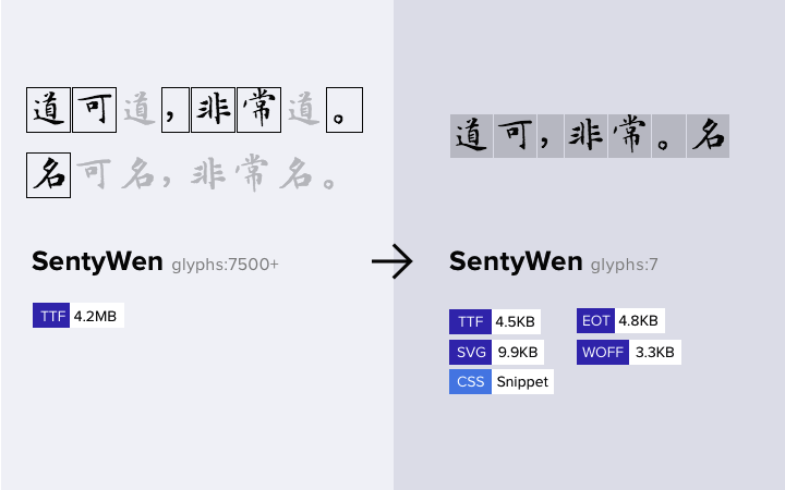
- A full version of Chinese font has at least 3500 characters for common use, this means the font files will be huge. For example, a full version of ‘Noto Sans CJK’ of Simplified Chinese has .otf files that may reach 115M; with 9 different font weights (hinted), each of them is nearly 16M, the loading speed can be affected and is likely to be far slower than a 26 character English font (the ‘Noto Sans’ for Latin script has a file size of about 200K for each font weight.)
- Chinese characters are formed with a varied number of strokes (dot stroke,horizontal stroke, vertical stroke, left-falling stroke, right-falling stroke,etc.). To display a Chinese character on a limited pixel matrix, we need to assign a reasonable amount of pixels to each stroke, which can vary greatly based on the font size.
- English letters, comparatively, are easy to write. Each character stroke is simple, people can write most of them in three strokes, so we can display different optimized arrangements and display the different style character fonts in a limited space.
- Chinese characters are relatively difficult, each character stroke is more complex, and difficult to distinguish between different characters in a finite pixel matrix. The end result is that the optimal arrangement is very limited. For example, now the general use of the main-text font size is usually in the range of 12~20 pixels, that means we can only display a character in pixel matrices 20x20 or smaller. This puts a lot of pressure on the browser’s rendering.
There are some other factors that hinder the Chinese webfonts like font license, windows clearType, and lack of practitioners to name a few. These factors lead to a limited availability of simplified Chinese fonts available, especially ones for screen display rather than print. You’re pressed to find a diverse selection of Chinese fonts, let alone many beautiful ones.
The Solutions
Although, there is a lot of helpful information out there a lot of the methods are too complex. Here is a list of some of the solutions that are out there:
- Remove the extra characters from the font files by tools like ‘fontlab’ to make it smaller and faster to be loaded. (This is ok for fixed content.)
- Use png/iconfont to replace the header text (Don’t do this for content, it’s only suitable for titles.)
- We have some Chinese webfonts cloud service providers to compress and host the Chinese webfonts with fonts licenses, but these fonts don’t have licenses, and that makes you, well, a pirate.
- Minify font seamlessly with open source scripts:
I propose a simple way that focuses on how to order your font-family by using the built-in web-safe font of different platforms. This is simple and will make using Chinese webfonts feel better. This is also one of the most common tricks that the Chinese developers use..
Basic Principles
- Choose the appropriate fonts for each platform.
- Avoid forcing a platform to use a font that is not suitable. ( e.g., Never order “SimSun” in the front of the font-family list, a Mac OS X which has installed the Microsoft Office Suite will install “SimSun” to the system, this may allow the system use it to display the web page. Believe me we got a bunch of other better choices than “SimSun”! )
- Make full use of the high quality fonts of each platform ( e.g., Hiragino Sans on Mac OS X). (See list below)
- For Windows, which has an anti-human font rendering effect, avoid using some terrible rending effect fonts (e.g.KaiTi) For content, we can choose from ‘SimSun’ and ‘Microsoft YaHei’, but for the title ‘Microsoft YaHei’ will be the best—— For some reason, ClearType can effect ‘Microsoft YaHei’ in some sizes it can become very rough (especially in bold). DirectWrite may help, but needs time to reach a more mature level, since it’s relatively new.
- Handle the relationship between size, line height, letter spacing, column width etc.
- Choose the matching English font.
Best Display in Different Platforms
- Windows:Choose from “Microsoft YaHei” and “SimSun”. If it’s bold or large text, it’s better to choose “Microsoft YaHei”. If this font isn’t installed, then it will be replaced by “SimSun”.
- OS X:”Hiragino Sans GB”: If it isn’t installed, will be replaced by “STHeiti” ( After ios9 /OS X El Capitan changed to ‘PingFang’).
- iOS:Uses default ‘STHeiti’ / ‘PingFang’.
- Linux:”WenQuanYi Micro Hei”
- Android: Uses default “Droid Sans”.
How You Can Order
Now we’ve reached it. Here’s how to order your Chinese font-family like a native.
Free:
font-family: ..., sans-serif;
Strict :
font-family: ..., "Hiragino Sans GB", "Microsoft YaHei","WenQuanYi Micro Hei", sans-serif;
(“…” means English fonts)
Above all, this is just a personal suggestion, but if you take a look at the font-family of different Chinese websites you might find most of them following the above principles. With higher quality of screen definitions and the increasing number of Chinese webfont practitioners, Chinese webfonts and support for webfonts will get better.
Stay tuned
Follow our newsletter or our WeChat account; every other week you'll receive news about what we're up to, our events and our insights on digital products, omnichannel, cross-border ecommerce or whatever the team fancies.
-
Add us on WeChat

-
Subscribe to our newsletter