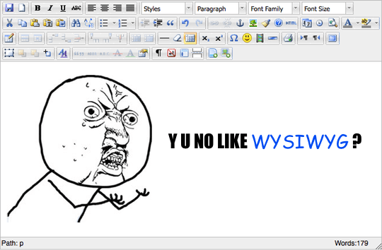
Avoid WYSIWYG Editors

A few years back, I would probably have not thought twice about this; shipping a site with a WYSIWYG editor seemed then as natural as ensuring Google Analytics is set. It was a feature that many clients would just assume you’d add. Over the past few years however, I and my colleagues grew tired of WYSIWYG editors; mentioning TinyMCE or CKEditor would probably earn you a squint of disapproval from the team.
What’s our grief with WYSIWYG editors?
First, I’d like to acknowledge that these editors are, for most, great pieces of software; they integrate in a wide range of projects, “get the job done” (depending on your interpretation of what “done” is) and really ease the adoption process with a certain type of audience. They offer an overwhelming volume of extensions and settings which can really cater to the most bizarre use cases.
That being said, we see some of these strengths as issues;
- Ease of adoption is usually the biggest reason invoked for using these editors; “We don’t have time to train people to write for the Web, provide them with an interface as close as possible to their beloved Microsoft Word and they’ll be set”. Except we don’t think letting people bring their regular word processor habits online is that great of an idea. The Web is a medium of its own, with specific constraints and capabilities; you do not think of layout, semantic or media in the same way as you do for, say, print.
- Feature-rich; oh the intoxicating power of adding every single feature the client ask for. Want to have buttons to add pictures, form elements, special characters or iframes? Easy peasy lemon squeezy! Now, I understand why these things get added, but will it really benefit the end user? We are big proponents of simplicity; the Explorer UI improvements proposed by the Microsoft team is a perfect example of how an attempt at empowering the end user with a wider set of features can go really wrong. KISS.
This usually translates in a plethora of symptoms, some of which you may have experienced first hand;
- Poor SEO, caused by a lack of semantic, markup sugar-coating (think about the wonderful code that is being dumped in an editor when people are copy-pasting their content straight from Word) and about a gazillion other bad things that happen with that copy-pasting magic or “power user features” (aka “The Button of Doom”).
- Broken layouts and styles, because people like to customize (understand cyan with a Comic Sans font), or simply dumping content from a Word document. There is nothing more frustrating than a user taking down the front page you carefully crafted by simply posting a blog post with unclosed markups.
And the list goes on. Moreover, as time pass, people ask for even more “essential features” which in turn leads to even more ways of breaking things up. The complexity piles up, and you end up with a pretty nasty piece of code sitting at a crucial bottleneck of your publishing workflow.
We believe that, overall, the use of WYSIWYG editors tends to reinforce the spread of bad practices with regards to Web editing.
So what do we propose then?
We’ve been going all Markdown for the past few years; it’s clean, easy to pick up and covers 99.999% of your needs (seriously).
And this is what we strongly encourage our clients to go for. Users may complain at first, pointing at the difficulty of learning yet another way of editing their content or its (intentional) lack of functionality. But there is an inherent efficiency to writing, for example, a link as simply as [Text](http://link.url.com); no three steps process with a modal dialog or weird shortcuts, just write it as is. And we think there is a lot of value in this approach;
- It keeps things simple for developers; no heavy JS plugin to load, no complex modal interactions to add markup, no browser compatibility headache or integration debugging. It is easy to put in place, rock solid and easily extensible.
- More importantly, it ensures that the generated code is semantically correct, clean and ultimately help writers focusing on content; when you use Markdown you have no way of fiddling with complex layout, advanced table features or image alignment. You focus on what you’re supposed to do: writing content. Well structured, lean, straight-forward content. And if the end result is not satisfying design-wise, then it may be a good idea to bring your design suggestions as a site-wide style improvement, as opposed to hack your way through with the help of a WYSIWYG editor.
There are a couple of things that could use some improvements. Media handling In particular, like inserting images, would be nice if slightly more streamlined than manually uploading a file in one place and then pasting the URL in your content; we’re actually working on some UI improvements for these specific problems. We have as well in some cases used our Markdown capable version of BUEditor on some Drupal 7 sites to help the editors ramp up with the basic syntax.
Let’s sum it up; WYSIWYG bad, Markdown good.