Designing UI Guidelines
User interface is easy to make a mess out of. You can start a project with one style and end with another. It doesn’t matter if you are a guru or just dabbling, inconsistencies in the design will most probably arise. Don’t Worry! There is an easy solution: UI guidelines.
Before Using UI Guidelines
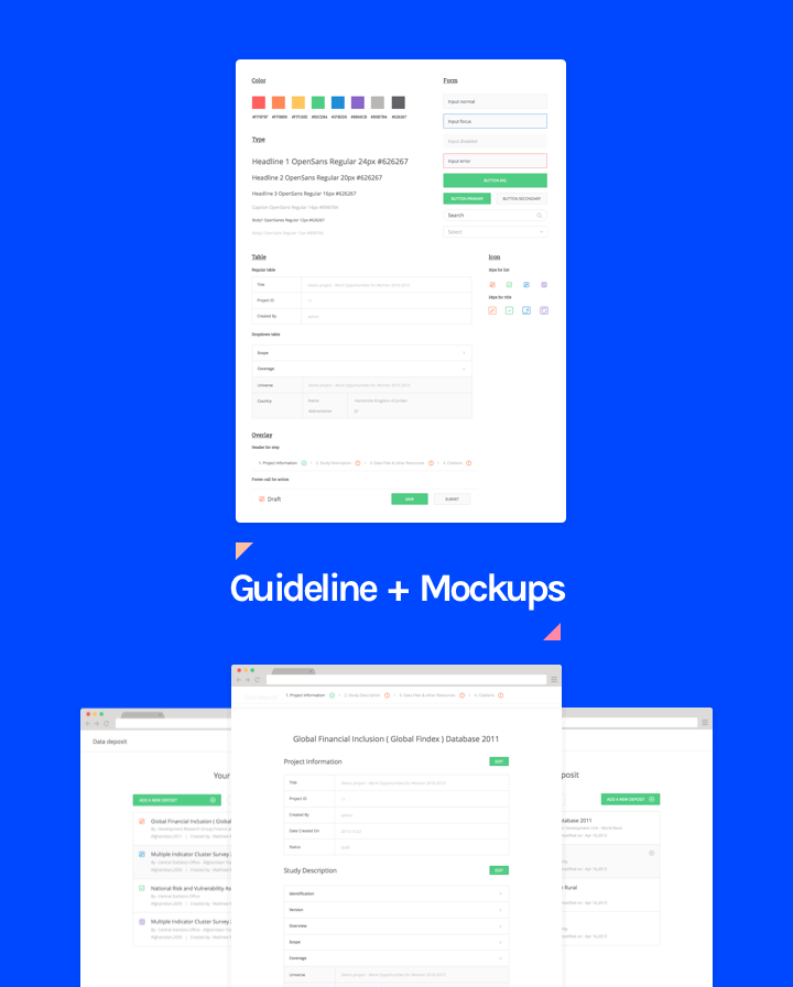
We wasted time creating excess mockups that we didn’t use. We created many pages that had the same UI contents such as maps, tooltips, input fields, buttons or headers. Designs were quite often done at different time and resulted in discrepancies that affected the overall UI and UX. Defining the element style at the beginning of the project, will allow for the inheritance of a default style. Saving time and unifying the product.
We created too many stylesheets for the frontend developers to implement. Since we designed stylesheets individually, we would sometimes use 40px for a button and other times 46px. We faltered between flat and skeuomorphism style and for example could create more than 3 variations of the search bar. It was not only a logistic nightmare but time consuming and frustrating to implement for the frontend developers.
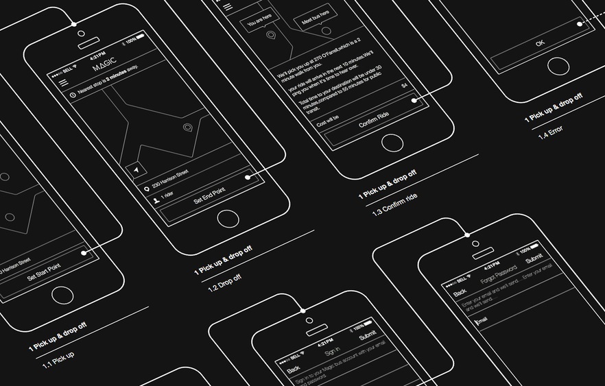
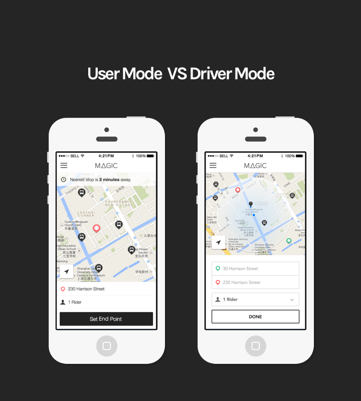
Breaks in projects caused consistency problems. As an example, for our Magic Bus project we had two modes. We designed the user mode first then after 3 weeks, had to design the driver mode. In that time my design had evolved resulting in a different style and layout for the driver mode.
High communication costs between the developers and designer. We didn’t include the subtle design details (eg. margining, padding, alignment, weight, radius, etc.) in our mockups. Without the details the developers weren’t able to implement the design to the specifications. We had to speak with each developer personally to fix the UI problems which led to continuous changes and discussions.
We had no rules. Nothing to anchor us. Every time we started a new part of the project we were implementing a new feature. Innovation and inspiration were happening at the end of projects, not at the beginning.
How we started
The solution was simple as we were skipping a step. It is not possible to write a book with out an outline. Structure was severely needed: we needed a guideline.
We created the first guidelines by reviewing completed projects and customizing the Google material design guidelines. We reworked each project using the guideline improving the overall UI. We did this over and over and over each time making the guideline leaner. We implemented the following strategies:
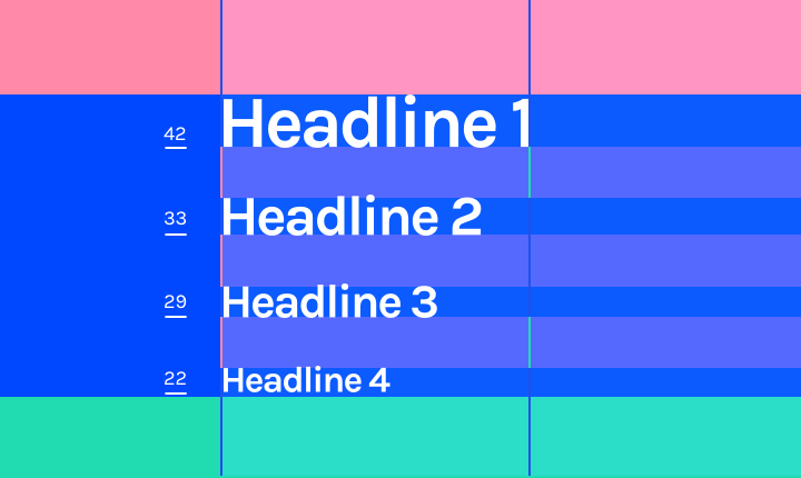
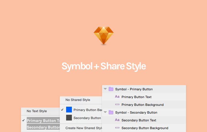
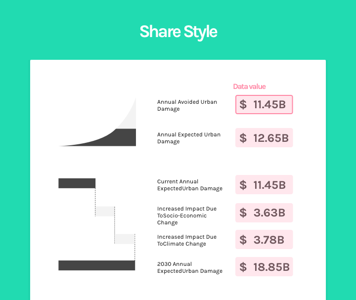
When you change one, you change them all. We use Sketch Symbol and Share Style to link all similar elements such as data values, bodies, heading and so on. This improved the timing of the delivery and reduced the number of style sheets we had to go through. Share Style guarantees consistency in style for all the points.
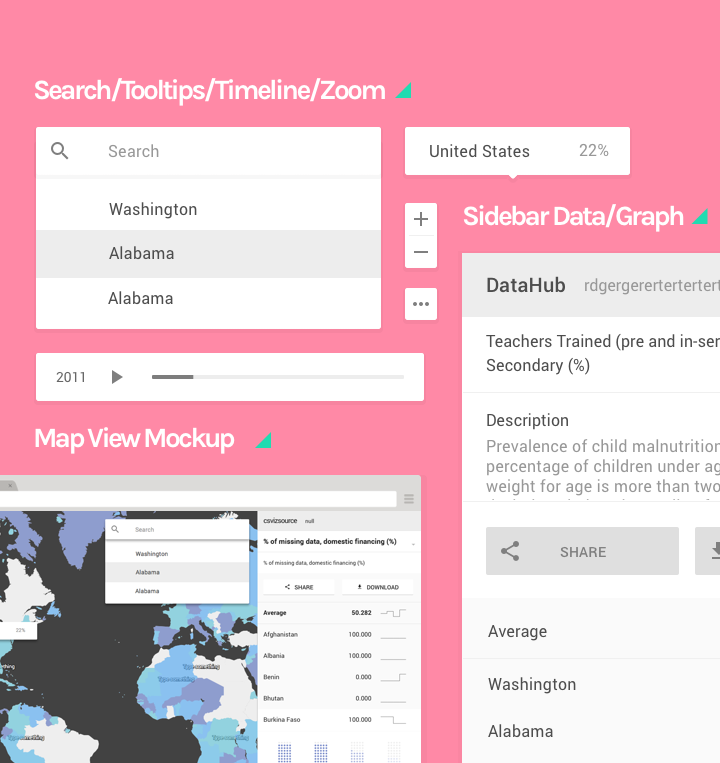
Layers create priority. One of the key principles for one of our project CSViz, was to use different shadow depths to present objects in a 3D space and therefore enforcing the information’s priority. We used the z-index to implement this. The higher the priority the higher the z-index (depth).
Going forward we used the same priority matrix for the map view design. The map view had a very complex interface with various elements: map, map controller, search, timeline, tooltips, and data visualization in the sidebar. We didn’t want this to get messy so we correlated higher importance with higher depth.
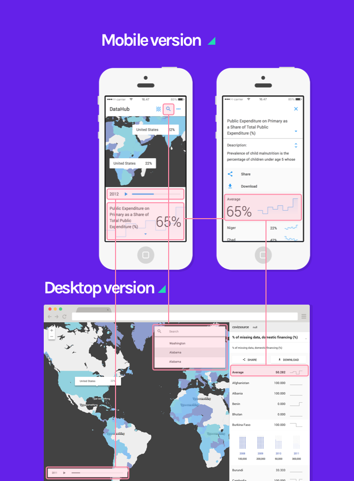
Accessibility on all devices. Unfortunately, there is no catch-all guideline for devices. We studied Google’s guides to find differences and connections between the style guideline across different devices. We found that the material guidelines often combine desktop and mobile together but sometimes only show how to present the UI elements in mobile but not in desktop. Since the font size, padding, margin, icon boundary are not similar for different devices you can’t scale and make proportionable across devices.
We found out that making a stylesheets for each device (think desktop, tablet and mobile handset) ensured that we kept the same design feeling across all devices.
How we build our UI guidelines
Standardizing the UI across all devices has been the biggest challenge for us. Through trial and error we found that leveraging team work is irreplaceable. The design team works directly with the developers to learn how they implement the stylesheets in “reallife”. A few questions we usually ask our developers:
- What will happen when the browser size changes?
- How long will it take them to add a gradient background to the graph?
- Is it possible to have the mobile web app behave more like a native app
The more discussion we had the more consistent and polished our final product ended up being. From this we extracted a motto:
A guideline should work for the whole team, not just the designer.
It’s not just some fancy UI kit you can find on Dribble. A guideline is a visual language communicating the design goals to the team, it is important to make sure that every one can understand it and to enforce its usage.
Takeaway
Less is more. Focusing your design to help support a simple and clear statement/purpose creates significant improvements on how the user interacts with your page or product. Although we have come a long way, we hope we can find a better management and notification tool to keep our team updated during the entire design process. We also want to make an online version of the guideline so that we can collaborate more efficiently with the team and our clients during the design process. Standardizing and streamlining our guidelines is our priority to ensure a leaner and faster development cycle across all devices.
We will provide an example of our UI design summary in an upcoming blog post. Sign up for our RSS feed or mailing list to make sure you don’t miss it!
Stay tuned
Follow our newsletter or our WeChat account; every other week you'll receive news about what we're up to, our events and our insights on digital products, omnichannel, cross-border ecommerce or whatever the team fancies.
-
Add us on WeChat

-
Subscribe to our newsletter